


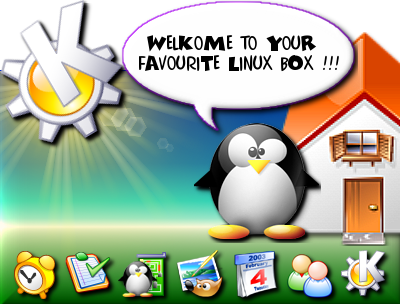
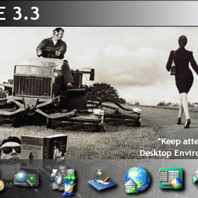
"Keep Attention" Splash Screen v.1.0
g3ntux


Source (link to git-repo or to original if based on someone elses unmodified work):
Updated: v 3.1: removed the author attribution according to reasonable request :-) Have fun!
---------
v 3.0: new look 'n feel!
...mmm ? Customized version ?


More KDE 3.x Splash Screens from g3ntux:
Other KDE 3.x Splash Screens:


Ratings & Comments
6 Comments
my favorite lB will get this soon... because Linux is better than the crud that Gates has!
Nice personal touch in design. I voted for it, but I won't be using it due to the designer attribution. I also don't particularly like the stock Kontact icons you used, I think you should pic an icon theme and use it, either crystal or nuvola or whatever you like. I look forward to your updates.
pls.. see the new version. thanks!
one (fatal?) mistake I found: the house. When the 'sun' is located on that top-left position, we shouldn't be able to see the house roof. our eye position should be below the house, thus we can't see the roof. If there are only the penguin and the sun, then it is alright. But if you add the house, that house you have there won't fit the perspective. IMHO :)
Your comment is correct :-) Perhaps using the great David Vignoni's Nuvola icon set it's possible to obtain a better perpective.. I'll try :-) THX
It's a nice splash! I definitely like the icons' shadows and the welcoming Tux. This is a quickly developing project: two versions posted in a bunch of days, so I'm waiting 3.0.