


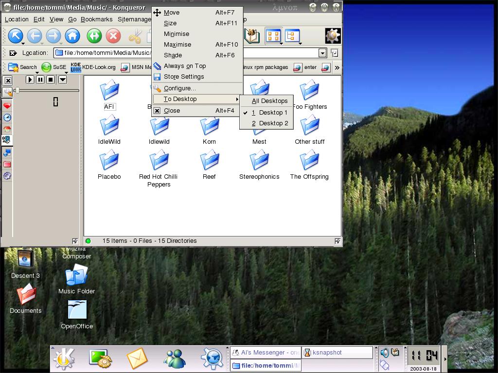
Oh yeah the button arrangement(its hard to tell) is the standard:
Menu#####################Min Max Close
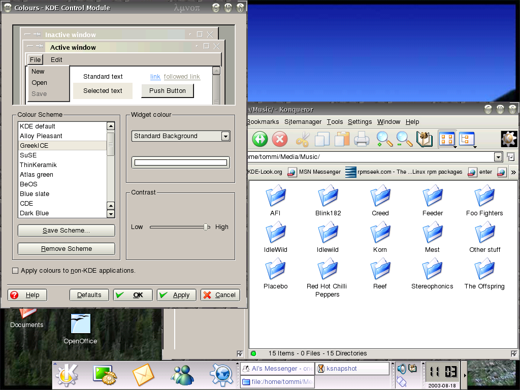
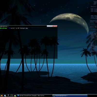
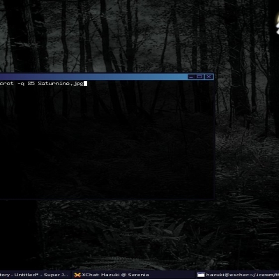
Now comes with matching colour scheme for all you colour co-ordinated people out there


Source (link to git-repo or to original if based on someone elses unmodified work):
31/07/03 v0.3 - renamed to greek after correction from phoenix, thanks =) for that. erm also clarity on buttons you can now see the sybols. darker titlebar.
18/08/03 v0.3.1 - added colour scheme, now two screenshots.


Other Ice-WM Themes:

Ratings & Comments
14 Comments
As long as you chose to put greek leters, let them have some meaning. On close button but greek 'k' for kleio (close). On Minimise put greek 'e' (epsilon) for elattono (minimise). And for Maximise I'd sugest greek 'a' (alpha) for anoigo (Open). At least this way it's gonna have some meaning.
say, thats an idea! thanks :) ill do it im don't know much greek except what i learned in one lesson in year 5 "kalimera" meaning i think, good morning. thank you very much for the direction. :)
actually im not gonna. yes, it would give it some meaning but it makes the buttons look really crap i've tried it. thanks for the suggestion it was good idea. any thoughts dont hesitate. i take it you didnt actually like the deco in the 1st place?
or something like this: epsilon (e) for "elachistopiisi", minimization, mi (m) for "megistopiisi", maximization, sigma (s) for "skiasi", shade, kappa (k) for "klisimo", close alpha (a) for "anigma", open tau (t) for "termatismos", termination the bad thing is that most of these characters might not seem so exotic to you, as they resemble to respective latin characters or scientific symbols, so you may consider using letters like phi, psi, ksi, omga, etc, even if they do not mean anything... ps: indeed, kalimera means good morning :) out of subject: Why I may not type non-latin characters? Shouldn't be better using Unicode?
It's great to something which is truly original for once! The decoration is quite nice and I like it a lot.
A great greek look! (eheheh) I really love it, original, particular and eye-candy!
hey there sport! i think this is really good =) well done, love u lots xxx
... the symbols you are using are not "hieroglyphics", they're just greek alphabet letters! Please, before writing make sure you know what you are writing!! ;-) Greetings from Italia, E.U.
yeh i know, but i though heirogyphics wud maybe sound better? well ill update the theme so that both of u r satisifed. ill make the buttons more distinguishable, there in the normal patern: Menu######################Min Max Close and il rename it greekICE or something. thats if you think it COULD be a good deco? reply so i know what to do. teenagers are not decisive....
ive done all tht now, if ppl hate it ill delete it, but this is a MAJOR improvement, it clears up all your points you made and is clearer, thinner border also the old one was ugly as hell :P
You sound soo cute... :)
he he what makes you say that? i try my best :P
I would say you are wasting your time, as it is. I can't discern any difference between the buttons... which one is close/min/max ?
please take the time to comment i need to know if im wasting my time here, if not, how can i improve the theme? even if its just a small comment :P i recieving good vibes from the votes, so tell emhow to make it even better, please?