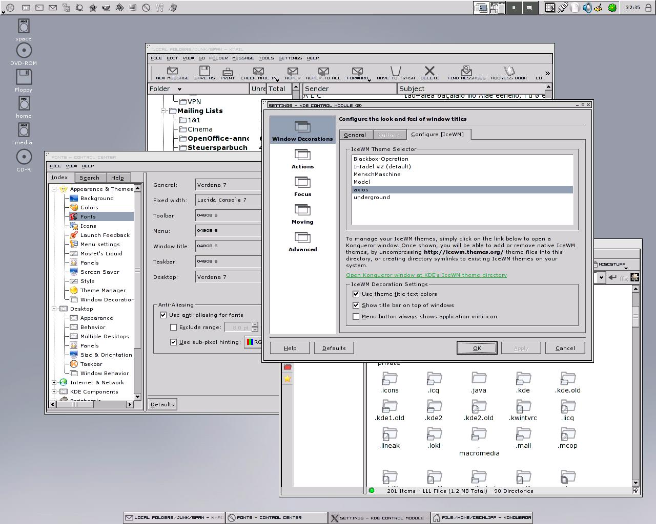
Description: This window decoration is based on the Axios Enlightenment theme from Tokyo, who has ported it from Gear and Allout. I have changed it slightly so that it is possible to convert it to an IceWM theme.
The font I use for the title, 04b08, is included in the package.
Unfortunately IceWM themes have their limitations: The title text is not aligned as it should be and it does not look as it should in shaded mode. Too bad that I do not have the time to code a native decoration.Last changelog:
I am absolutely wowed at this one
1- It has a very convienent design
2- It has a sort of futuristic look
3- It's not a mac knockoff
4- It's original.
VERY NICE
10/10
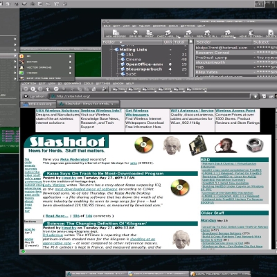
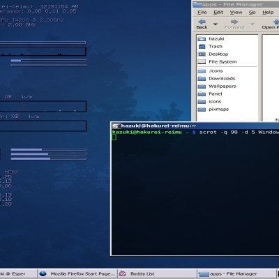
This is the normal external taskbar extension of KDE with Slicker icons, which can be found on KDE-Look.
BTW: I've sent you an email with another font, that might work for you. No guarantee though.
well, my kde external taskbar does'nt look
like yours. mine has full screen width, and
i can't figure out how to setup a fixed width.
I'm using kde 3.1.1 on a gentoo box.
- Start the external taskbar.
- Right click on Panel and select "Configure Panel."
- On the Layout page choose the Arrangement tab.
- In this tab select External Taskbar on the right.
- Set your desired Position and the Length. In my example the position in at the bottom center and the length is set to 1%.
Just thought I'd mention that the Slicker icons aren't called that any more :) Also, yes, it's really nice what you've put together there :) I'm not sure if I would personally use it, but it looks really pleasant :) Thumbs up from this direction definately!
The font was included in the Axios Enlightenment theme. So this won't help you. But maybe you can find a different font that has ALL-UPPERCASE LETTERS.
Why is it that _every_ KDE/Qt theme out there uses those ugly beveled borders for splitter windows?
Is there some limitation in Qt or so that prevents people from making it just flat and nice instead?
Not saying this to bash on your theme, I'm just wondering why people are doing this because it does not look nice.
Well, could you show us an example of what you want? Maybe the mkultra style?
Anyway... It's impossible to find a style that fits everybody, so live long and prosper ;-)
>> Well, could you show us an example of what you want? Maybe the mkultra style?
Hm, I just noticed this is the IceWM section.. err, sorry :)
(I was referring to the widget theme)
Anyway, one example of a splitter window can be found between those 2 main areas (listview and config view) in the control center.
>> It's impossible to find a style that fits everybody, so live long and prosper ;-)
Yeah, but this (the splitter issue, not your theme :) is just un-artistic (or however that should be said :P).
I'm not the only one who dislikes that splitter in most (all?) widget themes, btw.
I've read some complaints about it at dot.kde.org as well (can't remember the link)
I, too, have complained about the splitter before. I also saw another post recently about it... anyway, I have found that the Mandrake Galaxy theme has a beautiful, simple, and elegant splitter. I have always wondered why Keramik (the default theme!) has that eye-sore of a splitter. Oh well......
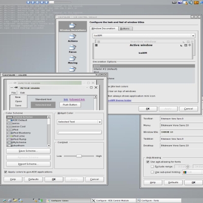
I like the pixel borders. Very nice. But could I suggest seperating the buttons by like a 3 pixel bevel? I don't like how all the buttons in the top right are in the same "pane".
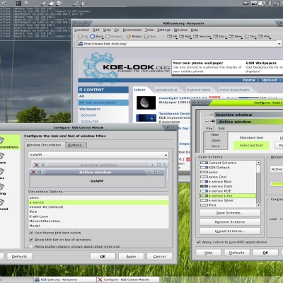
That's how the original Axios theme looked like and that's what I wanted to achieve. However IceWM requires all borders to have the same width and therefore I didn't find out, how to do that cleanly. It's pretty complicated to explain. If you can give me a hint, I will do it exactly like in the original: http://themes.freshmeat.net/projects/axios/
I guess to have an identical theme, someone has to code it.
IceWM is a stacking window manager for the X Window System graphical infrastructure, written by Marko Maček. It was written from scratch in C++ and is released under the terms of the GNU Lesser General Public License. Wikipedia


Ratings & Comments
19 Comments
I really like this one.
I am absolutely wowed at this one 1- It has a very convienent design 2- It has a sort of futuristic look 3- It's not a mac knockoff 4- It's original. VERY NICE 10/10
...but which KDE style are you using? It looks really good with the windec. I've been digging for something similar, with no luck.
QtCurve 2nd Version and Reinhardt Icons
and how do you get your nice taskbar ?
This is the normal external taskbar extension of KDE with Slicker icons, which can be found on KDE-Look. BTW: I've sent you an email with another font, that might work for you. No guarantee though.
well, my kde external taskbar does'nt look like yours. mine has full screen width, and i can't figure out how to setup a fixed width. I'm using kde 3.1.1 on a gentoo box.
- Start the external taskbar. - Right click on Panel and select "Configure Panel." - On the Layout page choose the Arrangement tab. - In this tab select External Taskbar on the right. - Set your desired Position and the Length. In my example the position in at the bottom center and the length is set to 1%.
Just thought I'd mention that the Slicker icons aren't called that any more :) Also, yes, it's really nice what you've put together there :) I'm not sure if I would personally use it, but it looks really pleasant :) Thumbs up from this direction definately!
nice theme ! i'd lilke to know where did you get the font ? I use a french locale ,
The font was included in the Axios Enlightenment theme. So this won't help you. But maybe you can find a different font that has ALL-UPPERCASE LETTERS.
Why is it that _every_ KDE/Qt theme out there uses those ugly beveled borders for splitter windows? Is there some limitation in Qt or so that prevents people from making it just flat and nice instead? Not saying this to bash on your theme, I'm just wondering why people are doing this because it does not look nice.
Well, could you show us an example of what you want? Maybe the mkultra style? Anyway... It's impossible to find a style that fits everybody, so live long and prosper ;-)
>> Well, could you show us an example of what you want? Maybe the mkultra style? Hm, I just noticed this is the IceWM section.. err, sorry :) (I was referring to the widget theme) Anyway, one example of a splitter window can be found between those 2 main areas (listview and config view) in the control center. >> It's impossible to find a style that fits everybody, so live long and prosper ;-) Yeah, but this (the splitter issue, not your theme :) is just un-artistic (or however that should be said :P). I'm not the only one who dislikes that splitter in most (all?) widget themes, btw. I've read some complaints about it at dot.kde.org as well (can't remember the link)
I, too, have complained about the splitter before. I also saw another post recently about it... anyway, I have found that the Mandrake Galaxy theme has a beautiful, simple, and elegant splitter. I have always wondered why Keramik (the default theme!) has that eye-sore of a splitter. Oh well......
I've just looked into the IceWM section and found lots of flat decorations.
Try dotNET or Plastik, they both have a "flat" look.
I like the pixel borders. Very nice. But could I suggest seperating the buttons by like a 3 pixel bevel? I don't like how all the buttons in the top right are in the same "pane".
That's how the original Axios theme looked like and that's what I wanted to achieve. However IceWM requires all borders to have the same width and therefore I didn't find out, how to do that cleanly. It's pretty complicated to explain. If you can give me a hint, I will do it exactly like in the original: http://themes.freshmeat.net/projects/axios/ I guess to have an identical theme, someone has to code it.