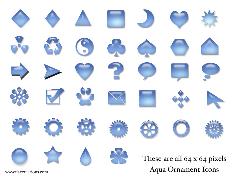
Description: These icons are the basic beginning of an entire set of Linux icons designed with the Mac's Aqua interface.
While at the moment they are not attached to any mime types, applications or other, I am soliciting feeback on them as a base collection of shapes.
They are all 64x 64 pixels in size.
I need to know: How do they show up on your desktop? Is the size adequate? Do you find them attractive? What would YOU do with them from this point. Other feedback
This would be really appreciated as I think a set of Aqua icons would be real nice.
- I'd like other colors (orange, for example) as another poster said it.
- sound , paint, tux, folder, microphone icons I'd like to have too.
Good job :)
/ranting/
I really dont understand some ratings on kde-look, but I think that's democracy, as long as no one is cheating.
/end of ranting/
Why not donate them to open office.org for use as clip art?
They seem like generally useful objects, and clip-art like that is what Open Office .org needs...
I know myself, personally, I have been considering encouraging such a thing for a long time now...
thanks,
Greg Brubaker
I agree with this. These have the makings of a nice collection of clip art. OpenOffice.org are looking to get clip-art together (check out ooodocs.org and ooextras.sourceforge.net) and I think Kristof Borrey of iKons fame is doing something for Koffice.
Nice work!
These icons looks nice. However, since blue-ish desktop is becoming sort of standard for KDE, these icons with the same color would make the desktop very monotonous. Perhaps others who got different color schemes might have a different opinion.
At this point, I've found one great place for the preview icons. They can be extremely useful in the slides (kpresenter/staroffice). The arrows, bubbles etc. looks just right. Scalability is a desired quality for such purposes, though.
Another possible use is for konqueror/kmail/other KDEapp. buttons. They would look great on them.
Cheers!
--Reks
They're pretty okay, although I try to keep my desktop's bubblynes (?) to a minimum. But it has potential. How to work them out, I wouldn't know I'm not good at that stuff. :)


Ratings & Comments
7 Comments
Some of these would DFINITELY be great for use as Konqueror buttons. It's pretty obvious which ones, so I won't go into that.
- I'd like other colors (orange, for example) as another poster said it. - sound , paint, tux, folder, microphone icons I'd like to have too. Good job :) /ranting/ I really dont understand some ratings on kde-look, but I think that's democracy, as long as no one is cheating. /end of ranting/
why not for konqueror buttons ?
Why not donate them to open office.org for use as clip art? They seem like generally useful objects, and clip-art like that is what Open Office .org needs... I know myself, personally, I have been considering encouraging such a thing for a long time now... thanks, Greg Brubaker
I agree with this. These have the makings of a nice collection of clip art. OpenOffice.org are looking to get clip-art together (check out ooodocs.org and ooextras.sourceforge.net) and I think Kristof Borrey of iKons fame is doing something for Koffice. Nice work!
These icons looks nice. However, since blue-ish desktop is becoming sort of standard for KDE, these icons with the same color would make the desktop very monotonous. Perhaps others who got different color schemes might have a different opinion. At this point, I've found one great place for the preview icons. They can be extremely useful in the slides (kpresenter/staroffice). The arrows, bubbles etc. looks just right. Scalability is a desired quality for such purposes, though. Another possible use is for konqueror/kmail/other KDEapp. buttons. They would look great on them. Cheers! --Reks
They're pretty okay, although I try to keep my desktop's bubblynes (?) to a minimum. But it has potential. How to work them out, I wouldn't know I'm not good at that stuff. :)