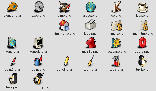
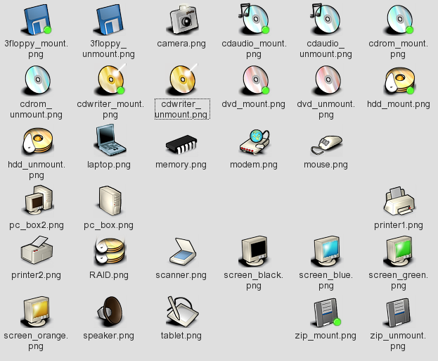
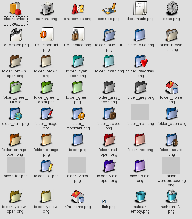
Description: After a looong break I made some new icons for my Free Icons project. Right now I have: - app icons - 25 icons - devices - 80% done - filesystem - 90% done - mimetypes - 1 icon as an example - no action icons.
I want do make a complete replace for KDE icons so much more work is needed. That's why all help and comments are welcomed. I'll start my project home page soon so all informations will be stored there.Last changelog:
First contribution to kde-look.org. A lot of new icons
Just what I've been looking for. The new crystal type icons just look blurry on the tiny panel at the bottom of my laptop screen. Finally some high contrast icons! Keep the sharp edges. Can't wait for the complete set!
work is going on on 'free icons'...
I love your icons and I'm glad
to see you've found the time
to work on the iconset.
p.s.:
remember
http://www.kde-look.org/content/show.php?content=540
? ;-)
...fantastic start! a lot of these icons look quite good. i like the angle thing you have going on. the konqueror icon is definately world class (tehehe)... too bad i don't use it for a broswer.
keep up the great work and i look forward to seeing a more developed iconset soon.
iKons, Slick, Crystal, Marbles and now this one. There are some really promising icon sets around. I hope their respective maintainers have enough energy and the will to complete them.
if i'll end 48x48 i'll probably make32x32 set but right now the oryginal icons can simply be scaled to 32x32 pixels (with mogrify for example). in next release i'll make 32x32 version.
Hey there!
I really like your icons. One of those who haven't installed crystal I really like to see more different icon sets. At the moment iKons are my favorite, but when your's are finished there is a really good chance that this icon set is getting on my desktop...
Great work so far, don't stop now!
so long,
red
Looks like you've got an AWESOME start here! Crystal is a great iconset, but KDE definitely needs a variety of great sets to choose from and it looks like you're heading in that direction. A couple suggestions:
- Any way to smooth the edges on some of the icons a little more? An example is 3floppy_mount but there are many others as well that have somewhat unsmooth edges - tops especially.
- is desktop.png yours? If not please give credit where due - a lighter version of it is my current desktop icon with the crystal set.
Besides for those things, GREAT work! Maybe after you're done with these you can make a theme to go along with them too ;-)
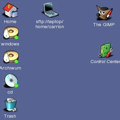
You did not change the kcontrol icon from iKons. While I like the iKons icon, I suggest making ALL fresh icons and also, if you choose not to, at least please give credit for the borrowed ones. Thanks! Keep up the good work!
yes, the desktop icon is mine. i guess the same lookin icon in iKons was taken from my idea. but i'm not quite sure.
All icons are made only in Blender with little retouch in gimp. I'm rendering them to 100x100 pix and then only scaling to 48x48. more retouch works will be made later i guess.
I'll also will release a .blend files later so anybody will be able to make their own renderings and/or retouches.
You might want to try rendering in 128x128 instead of 100x100... since all the KDE icons sizes are powers of 2 (16, 32, 48, 64...) you'll get better scaling from 128.
Altough it's not really my style, I do think these icons are looking great and pretty professional too :)
It's nice to see an iconset with a complete different style.
(I like the original mount icons too)
*thumbs up!*


Ratings & Comments
24 Comments
Just what I've been looking for. The new crystal type icons just look blurry on the tiny panel at the bottom of my laptop screen. Finally some high contrast icons! Keep the sharp edges. Can't wait for the complete set!
fabulous.....just what i've been waiting for. reminds me a bit of coplands work (which is good BTW). Keep at it and keep them coming.
Why look the gimp so sad ? :) But your icons are great.... not so techno style like the others. keep up your good work! Thanks! Rufinus
work is going on on 'free icons'... I love your icons and I'm glad to see you've found the time to work on the iconset. p.s.: remember http://www.kde-look.org/content/show.php?content=540 ? ;-)
Please go on. :-)
Mozilla's icon is wonderful!Too bad i can't read polish: I think you have some really nice stuff in your site too...
you bring light to darkness.. all other icon sets available for kde are just disgusting.. either ugly or too shiny.. once again THANK YOU!!! :)
...fantastic start! a lot of these icons look quite good. i like the angle thing you have going on. the konqueror icon is definately world class (tehehe)... too bad i don't use it for a broswer. keep up the great work and i look forward to seeing a more developed iconset soon.
Huh, finally, after all these rounded, marbled clones, you make a real icon set. I voted for you :) Cheers, antialias
iKons, Slick, Crystal, Marbles and now this one. There are some really promising icon sets around. I hope their respective maintainers have enough energy and the will to complete them.
Excellent stuff. Totally and unreservedly. Please, please, please keep it up.
is a very good icons thanks!!!!
I think the shadows are way too black.. But they're still nice though :)
Very good iconss!! these are original
Could you add a 32x32 set as well?
if i'll end 48x48 i'll probably make32x32 set but right now the oryginal icons can simply be scaled to 32x32 pixels (with mogrify for example). in next release i'll make 32x32 version.
Hey there! I really like your icons. One of those who haven't installed crystal I really like to see more different icon sets. At the moment iKons are my favorite, but when your's are finished there is a really good chance that this icon set is getting on my desktop... Great work so far, don't stop now! so long, red
Looks like you've got an AWESOME start here! Crystal is a great iconset, but KDE definitely needs a variety of great sets to choose from and it looks like you're heading in that direction. A couple suggestions: - Any way to smooth the edges on some of the icons a little more? An example is 3floppy_mount but there are many others as well that have somewhat unsmooth edges - tops especially. - is desktop.png yours? If not please give credit where due - a lighter version of it is my current desktop icon with the crystal set. Besides for those things, GREAT work! Maybe after you're done with these you can make a theme to go along with them too ;-)
You did not change the kcontrol icon from iKons. While I like the iKons icon, I suggest making ALL fresh icons and also, if you choose not to, at least please give credit for the borrowed ones. Thanks! Keep up the good work!
yes, the desktop icon is mine. i guess the same lookin icon in iKons was taken from my idea. but i'm not quite sure. All icons are made only in Blender with little retouch in gimp. I'm rendering them to 100x100 pix and then only scaling to 48x48. more retouch works will be made later i guess. I'll also will release a .blend files later so anybody will be able to make their own renderings and/or retouches.
You should make sure you get credit in those other icon sets then ;-)
You might want to try rendering in 128x128 instead of 100x100... since all the KDE icons sizes are powers of 2 (16, 32, 48, 64...) you'll get better scaling from 128.
my desktop icon is inspired by the one of free-icons thanks :O)
Altough it's not really my style, I do think these icons are looking great and pretty professional too :) It's nice to see an iconset with a complete different style. (I like the original mount icons too) *thumbs up!*