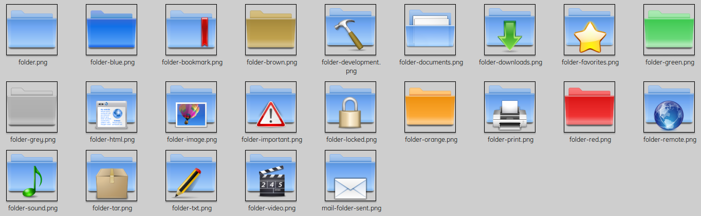
Description: This is a LITTLE replace-Set for the already unfinished oxygen-folders in KDE 4.3. I included some more icons (actions/apps) of reasons of my own gusts. If you want have it only for a folder-upgrade, please delete the actions-/apps-folders before installing.
Enjoy :-)
P No screenshots because I don't use KDE at moment. ;-)
PD2: Pinheiro or the Oxygen-Team have totally free use of my mockup-propose and can catch it all or partially for their Oxygen-Theme. ;-)
For *advanced* Users: The best is, of course, a native use of it. Means the copy of the folders in my content and paste it in the original oxygen-folder. For get the original "oxygen" status back you follow this example (Kubuntu):
- sudo rm -r /usr/share/icons/oxygen (unfortunately a very important step before) - sudo aptitude reinstall kde-icons-oxygenLast changelog:
0.5: Now it's a little Replace-Set-Theme ;9 0.6: media, turn-off-switcher, etc. 0.6.5: a little spoil up :-) 0.7: Colours: blue, brown, green, grey, orange and red. 0.8: mini-weather-icons in 22x22 and 16x16 included ;-) 1.0: NEW and fit for KDE 4.3 1.1: slighty improved 1.2: device-notifier much better 1.3: better volume-icons (more seeable on bright panels) and inode-directory
I really like your set, thanks !
Maybe you could do a colored version for each of these icons ? I love colored folders because I can spot them in a glimpse but there is no decorated folders with colors in the default oxygen theme (and not enough colors to my taste : dark grey, pink...)
:-)
:-) Thx. Good things needs a while. And yes I was planing it for the future. Firstly I want finish the works on the default-colour and stamp them all there are possibilities for doing it. Then correct the coloured ones. And finally do something like you proposed... ;-).
Thank you Dude. :) Simple on the right place is always a good alternative. I wanted only something more consistent and followed the user-home-example. ;)
Hey your Splash is nice ... wait for 1650x1050. :)


 No screenshots because I don't use KDE at moment. ;-)


Ratings & Comments
9 Comments
Yep, i really like it :)
Thx ;-)
I really like your set, thanks ! Maybe you could do a colored version for each of these icons ? I love colored folders because I can spot them in a glimpse but there is no decorated folders with colors in the default oxygen theme (and not enough colors to my taste : dark grey, pink...) :-)
:-) Thx. Good things needs a while. And yes I was planing it for the future. Firstly I want finish the works on the default-colour and stamp them all there are possibilities for doing it. Then correct the coloured ones. And finally do something like you proposed... ;-).
take your time and spoil us :)
Great idea. I really like where you went with this. Simple and nice :)
Thank you Dude. :) Simple on the right place is always a good alternative. I wanted only something more consistent and followed the user-home-example. ;) Hey your Splash is nice ... wait for 1650x1050. :)
Thanks for this mod. Your icons look much better (more consistent) that the default ones. Keep the good work.
Thanks. Will see what can I do ... :)