I've use both GNOME and KDE extensively, and like aspects of both. To put it short, KDE is far more advanced in most areas, while GNOME has a more "industrial" interface. I like industrial, but I couldn't put up with primitive dialog boxes and widget themes that looked like crap when in actual use. I grow weary of the cartoonish look of KDE, but I get even sicker at GNOME's low ranking on the evolutionary scale of DE usability. Yeah, that was a bad pun
So now, I've got the best of both worlds to suit my personal taste. Some may like the cartoonishness - nothing wrong with that, it's just that I need a change. Some may like the aqua-ishness - nothing wrong with that, in fact I'm one of the most fanatical make-it-look-like-OSX screenshooters out then and am partly responsible for inciting the latest aqua/crystal screenshot rampage. I just needed a change, ya know?
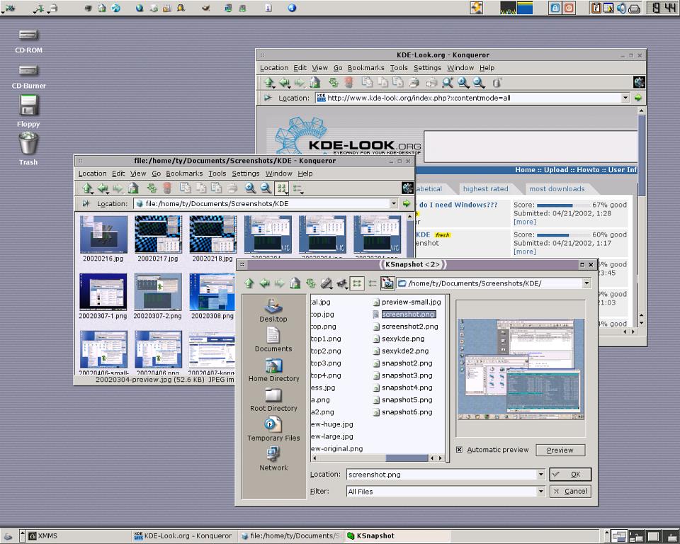
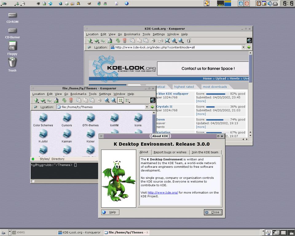
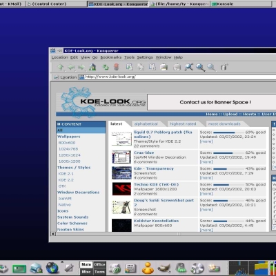
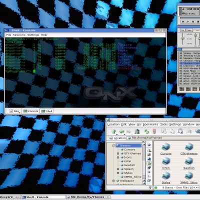
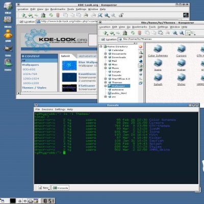
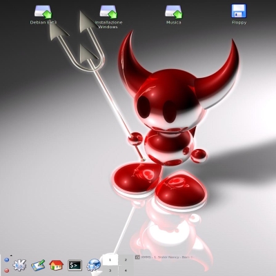
This screenshot is for those of you who like a more "professional" looking environment, or for those who simply want a change of pace from the latest rash of crystal-liquid-keramik screenshots from everybody and his pet monkey.
I was about to name this "Athlete's Foot", but I didn't want to start anything.
How I did it:
* Slick Icons 1.3.1
* Style: Light, 3rd revision
* Modified Blustripe wallpaper with my kicker shadows applied
* Modified Helix IceWM window decoration
* General and menu font: Verdana
* Color scheme: modified Redmond 2000
As usual, the previews are reduced for modem users, the whole kit 'n' kaboodle png on the download link.
Questions, comments, or suggestions welcome. Please, no "don'tcha GNOME sucks big ones, dude" style comments.
/me puts on flame-retardant vest just in case.











Ratings & Comments
1 Comment
By any change, have you come across any theme that has an equivalent for both KDE and GNOME? I like the looks of my applications to be consistent. So, I'm looking for one that shares common characteristics between the two environments.