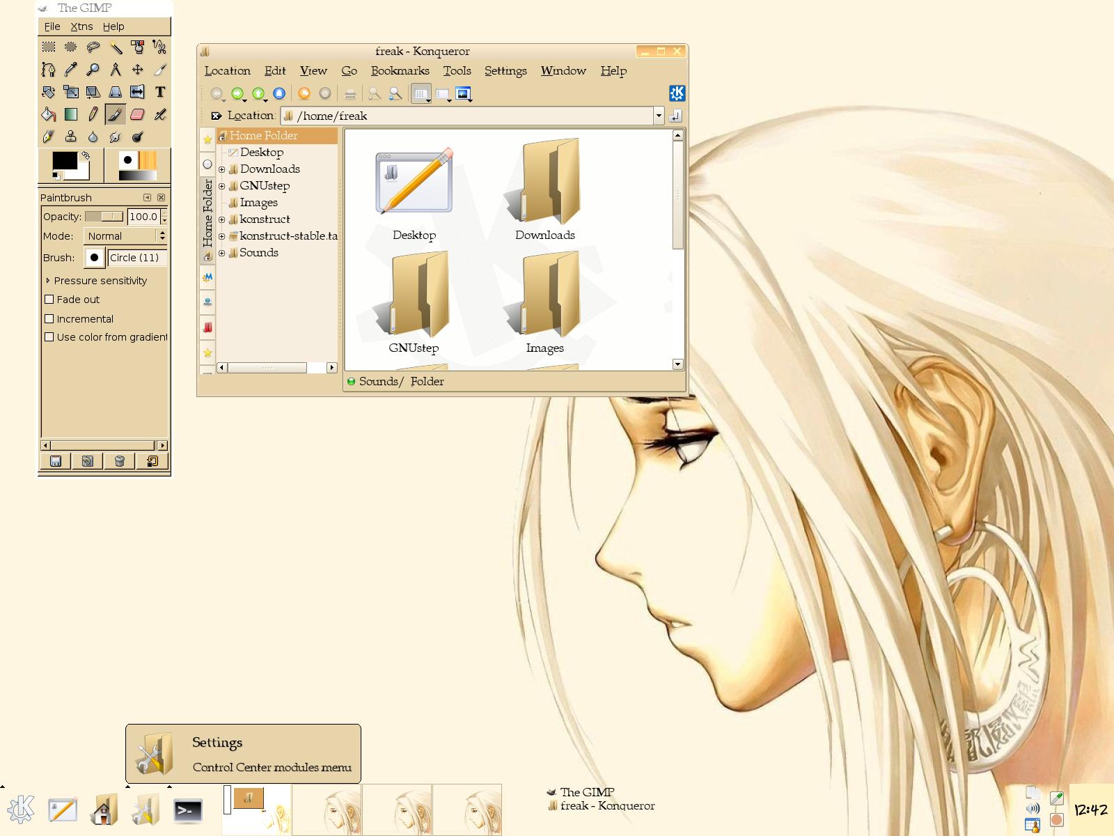
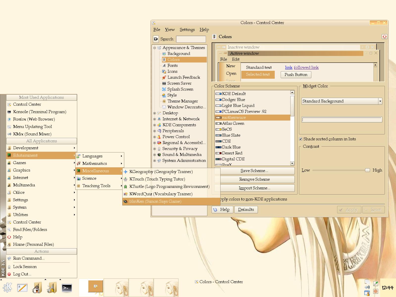
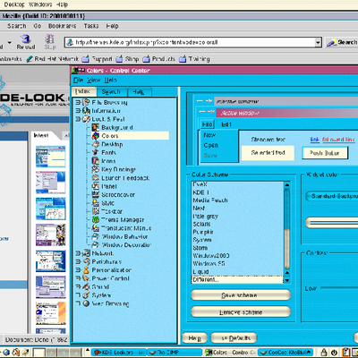
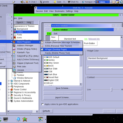
Description: This was just a color scheme I put together because I wanted something softer and easier on the eyes. I'm adding it here just in case someone else finds it useful.
NOTE: Your title bar colors will be darker unless you use the "Blended" windeco.
This is a very nice color scheme, very calming and relaxed... I like it a lot. Maybe I'll use it sometimes when I'm feeling tired or laid-back and need something gentler on the eyes than my usual bright colors.
Thanks. :)
I originally found the background at http://www.wallpaper-area.de/wa-1-508-5-0
I then edited it with the Gimp to get rid of the text. The site isn't in English, so I don't know the copyright on the image. If you need it without the text mail me at vredfreak (at) gmail (dot) com.


Ratings & Comments
6 Comments
This is a very nice color scheme, very calming and relaxed... I like it a lot. Maybe I'll use it sometimes when I'm feeling tired or laid-back and need something gentler on the eyes than my usual bright colors. Thanks. :)
Thank you very much. You pretty much summed up my entire intentions for this color scheme. I'm glad you can find it useful.
For me, I like this colors. There are really pleasant.
I'm glad you liked it. Thanks for the response.
Hy, nice Color Scheme but where can I found this wonderfull Background !
I originally found the background at http://www.wallpaper-area.de/wa-1-508-5-0 I then edited it with the Gimp to get rid of the text. The site isn't in English, so I don't know the copyright on the image. If you need it without the text mail me at vredfreak (at) gmail (dot) com.