Description: This is just a proposal, my ideas of what should be added to the Ubuntulooks engine. After looking at the code, I realized that I don't have any cairo experience so I will not attempt to create this theme myself anytime soon. If you want to code what I've proposed, go ahead and do that.
I also don't think that these should be implemented as radical changes. Perhaps some of the ideas I have could be implemented as options, the way Murrine does it.
And, of course, if you have anything to add, feel free to do so. I'd like to stimulate some discussion on how to make Ubuntulooks kick-a$$!
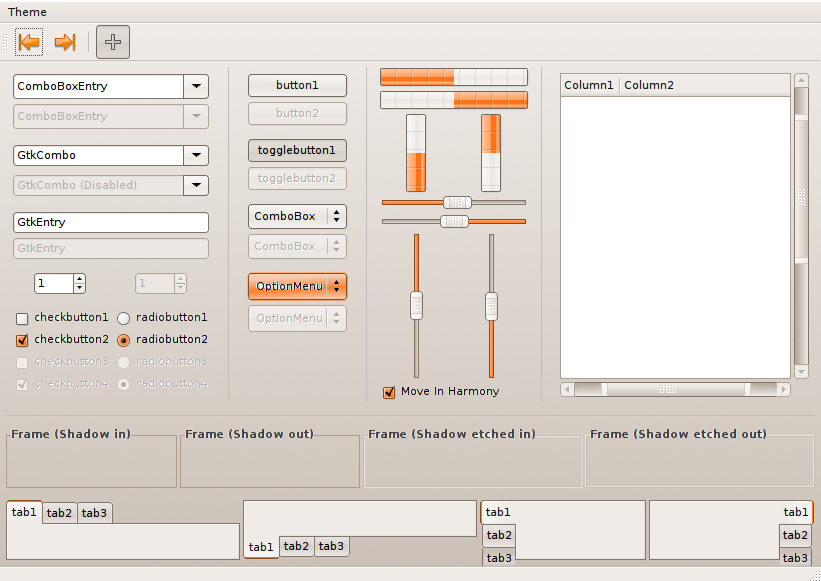
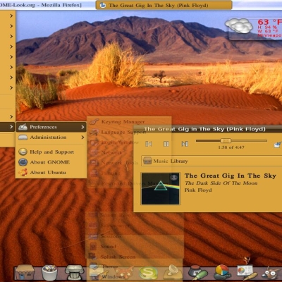
So where does all this come from? I really like how oxygen draws a gradient on windows, but I don't like much else of that theme so far. I don't know if GTK can handle gradients, but it would be a nice feature to have.
The gradients on the buttons have also been changed to make them a little subtler. All in all, I think the buttons should have a few options for different appearances (again, think Murrine for options, but not necessarily for styles). And highlighted buttons (as in the Options Menu in the screenshot) should have more apparent highlighting, IMO. The highlighting I created with The GIMP is really crude but I think it gets the idea across.
Finally, I love animated progressbars, but I don't like the Clearlooks/Murrine way of doing it. We need something new here. I was thinking that each of the blocks on the progressbar, instead of coming from the left, should come from the bottom. The progressbar would appear like a wave (think wave bars in music players). I don't know how to describe this any better, but I'll try to post an animated GIF later on.
So, if you have anything to add, whether good or bad, please share it. And if you know how to code cairo/GTK and you want to implement some of the proposals, you've got my support!
i agree the gradient on the window makes it look kick a$$ also the animated "wave" progress bar would also look really awesome so long as it was done well


Ratings & Comments
2 Comments
looks hot!
i agree the gradient on the window makes it look kick a$$ also the animated "wave" progress bar would also look really awesome so long as it was done well