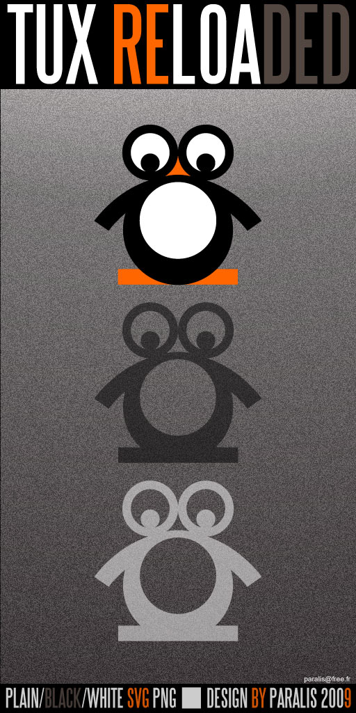
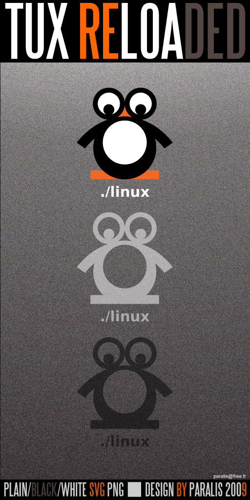
Description: This is my proposal for a new linux logo, derivated from Tux but designed from scratch to obey basic logo design rules. It is certainly not a revolution from a graphic point of view but that is exactly my point. Basic shapes, 3 colors (or a single one), no fancy effects. I think its simplicity provides also a large field for future customizations and animation too.
It's been several years, I felt the good ol' Tux which was not designed as a logo but as a mascot, was somehow a lil bit outdated even if cute. Considering the amount of derivative works, 3d tux of all kinds, icons, etc. I've seen around, I believe I was not the only one to think that way.
This logo can be used for multiple purposes and I hope some of you will find it useful.


Ratings & Comments
0 Comments