Okay, official development has started! Thank you very much for all your comments, opinions and suggestions, like you allready could see, we took notion of them! But now, like they say in Vegas, all bets or off. As soon as we have something ready in alpha, we'll let ya know!
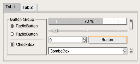
Well, most styles have this problem, but the strong contrast between border and background colors in this style makes it worse: The checkboxes look really pixelated. I don't know wether it's practical to do so, but it would be really nice if you could find a way to anti-aliase the checkboxes.
A few more suggestions:
- the scrollbar's width is still too small when compared to the space that is provided (the box that is draw around the arrows and scrollbar)
- the whitespace between the arrows and scrollbar should go (i.e. draw a box around the arrows and allow the scrollbar to scroll up against the box).
The scrollbar & arrows look good, but they're too unwieldy compared to most standard themes.
- the width of the sidebar's toolbar should be less. not sure if that's possible judging by the screenshot though.
- the hide/unhide toolbar widget should have a more neutral color. another shade of gray perhaps.
- (someone else made this comment) the orange in some cases is slightly too agressive (i.e. the box drawn around menu selection, button selection..)
- the box drawn around menu items on mouseover should be filled
The first screenshot is nicer than the sencond one, gray might be lighter, but also duller ;-).
I dislike the orange color though, it's not that it doesn't look good, it's just too agressive, I wouldn't use it all day. But if it can be changed from KControl I don't mind.
It makes it looked more professional. Also, without the seperation how does a user figurout what a toolbar is when everything is just one mass of seemingly (vertically) unordered buttons.
Looking good.
downloadable. We will start developing once we made up our mind how it will become. The purpose of showing this here, is to collect as much opinions, ideas, etc. as possible.
The development will start in about two days. The first alpha release will be in about two-three weeks I guess...
Hi,
I think the old button design and the slide rulew ere better. Maybe you should make 2 versions?
PS. It would be cool if you could put a snapshot of your work :) I really want to get rid of keramik...
...for your efforts. I personally find the new version much improved. Scrollbar and slider look better, it's more elegant.
Please, keep the colour scheme as restrained as it is. That is not to say that colours should stay exactly the same, but rather that I hope you will refrain from introducing flashy colours like so many other themes.
I personally think that KDE still lacks a really professionally looking theme fit for being used on a daily basis. I hope your theme will go in that direction.
Keep up your excellent work.
Hi,
Our style will come with a default color scheme (maybe two or so). But it will be fully modifiable, which means you will be able to choose your own colors.
If you like our style colorful, you can, if you want it more professionell, you can too.
Also the color of the button (I mean the orange line) will be modifiable. I want that the users of our style have as much freedom as possible!
... around the widgets.
I do not dislike the idea, though I would tune them to make them thicker: the way they are now widgets look "dirt" rather than "shady".
Anyway, pretty good style overall, both the simple and the more elaborated version.
Good job
Daniele
Hi,
In the coded version the shades will be more clean, not so *dirty* on the eyes. And something else, the colors will be modifiable, so maybe with other colors it looks less dirty. >We'll see.
Though this looks good but tabs look ugly in the screenshot. I would definitely back a GhostView like style; which is clean and soft on eyes. Press ALT+F2 and run "gv" to see it.


Ratings & Comments
57 Comments
I think this is great
Do you have some news on this project?? I'm really looking forward to installing the style! Patrik
Well, most styles have this problem, but the strong contrast between border and background colors in this style makes it worse: The checkboxes look really pixelated. I don't know wether it's practical to do so, but it would be really nice if you could find a way to anti-aliase the checkboxes.
A few more suggestions: - the scrollbar's width is still too small when compared to the space that is provided (the box that is draw around the arrows and scrollbar) - the whitespace between the arrows and scrollbar should go (i.e. draw a box around the arrows and allow the scrollbar to scroll up against the box). The scrollbar & arrows look good, but they're too unwieldy compared to most standard themes. - the width of the sidebar's toolbar should be less. not sure if that's possible judging by the screenshot though. - the hide/unhide toolbar widget should have a more neutral color. another shade of gray perhaps. - (someone else made this comment) the orange in some cases is slightly too agressive (i.e. the box drawn around menu selection, button selection..) - the box drawn around menu items on mouseover should be filled
The first screenshot is nicer than the sencond one, gray might be lighter, but also duller ;-). I dislike the orange color though, it's not that it doesn't look good, it's just too agressive, I wouldn't use it all day. But if it can be changed from KControl I don't mind.
configurable. We will deliver two color schemes or so with the style. Besides that you can change it how you want...
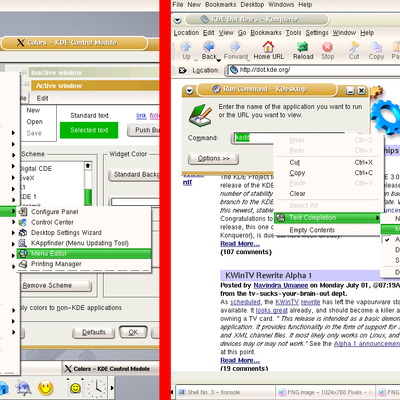
.. it lacks horizontal toolbar seperators (i.e. a thin, horizontal grey line which seperates two toolbars from eachother).
Hi, look at the second screenshot, added the lines
oh please, make it optional, i really do not want that line !
It makes it looked more professional. Also, without the seperation how does a user figurout what a toolbar is when everything is just one mass of seemingly (vertically) unordered buttons. Looking good.
I'll see if we can make this optional.
but please make a wm-decoration to go with it, or this is all just a wast of time...
That's the idea, we ain't gonna make just a style to go with thin air...;-) We will make a windec which goes along with this style.
your style is downloadable ????? because the download link go to a screenshot
downloadable. We will start developing once we made up our mind how it will become. The purpose of showing this here, is to collect as much opinions, ideas, etc. as possible. The development will start in about two days. The first alpha release will be in about two-three weeks I guess...
Ithink this is realy bad you have to make it more 3D if its going to be anything i will yous Jesse
the nature of this style. If I would go totally 3D, it ain't this style anymore. Sorry...
Hi, I think the old button design and the slide rulew ere better. Maybe you should make 2 versions? PS. It would be cool if you could put a snapshot of your work :) I really want to get rid of keramik...
Hi, Which one do you mean, the button hasn't changed much, besides the shadow then.
...for your efforts. I personally find the new version much improved. Scrollbar and slider look better, it's more elegant. Please, keep the colour scheme as restrained as it is. That is not to say that colours should stay exactly the same, but rather that I hope you will refrain from introducing flashy colours like so many other themes. I personally think that KDE still lacks a really professionally looking theme fit for being used on a daily basis. I hope your theme will go in that direction. Keep up your excellent work.
Hi, Our style will come with a default color scheme (maybe two or so). But it will be fully modifiable, which means you will be able to choose your own colors. If you like our style colorful, you can, if you want it more professionell, you can too. Also the color of the button (I mean the orange line) will be modifiable. I want that the users of our style have as much freedom as possible!
When, when, when, when, when is it ready for us?? This style looks great!! Please finish developing soon! ;) Sebbi
... around the widgets. I do not dislike the idea, though I would tune them to make them thicker: the way they are now widgets look "dirt" rather than "shady". Anyway, pretty good style overall, both the simple and the more elaborated version. Good job Daniele
Hi, In the coded version the shades will be more clean, not so *dirty* on the eyes. And something else, the colors will be modifiable, so maybe with other colors it looks less dirty. >We'll see.
Though this looks good but tabs look ugly in the screenshot. I would definitely back a GhostView like style; which is clean and soft on eyes. Press ALT+F2 and run "gv" to see it.