Description: A Plasma color scheme,with matching GTK and Konsole themes.
Here are a few details about and how this look is achieved.
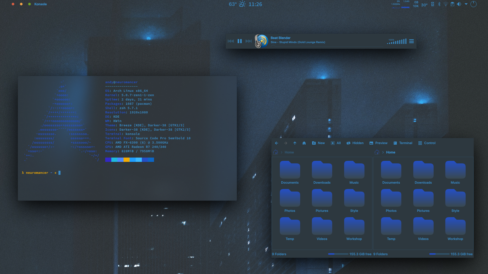
The panel is Latte-Dock,the reason for choosing Latte-Dock over the Plasma panel are the customisation options,and transparent panels are transparent,unlike Plasma panel which if you enable blur,is blurred too with no way to disable it,plus there are no visual lines on edges.
To hide the window decorations first set the window decoration to Breeze,then click "Configure Breeze" go to the "Window-Specific Overrides" tab,click add,then
Matching Window Property: Window Class Name
Regular Expression To Match: .*
Then under "Decoration Options",tick the "Border Size" box and set to "No Border",and also tick the "Hide Window Title Bar" box as well.
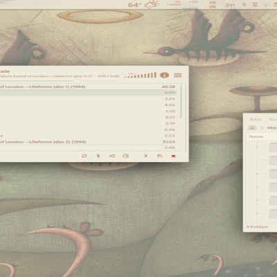
The widget on the left of the panel is Active Window Control,that is set for the window buttons,you can set it to any buttons you like as long as the theme is installed,and a global menu that appears on mouse-over of the application name.
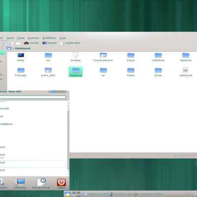
The icons are Suru++ Asprómauros,to make them look like this,right click the folders with emblems (Downloads,Music,Pictures etc.) and select properties,then under the General tab,directly under the word General is an icon,click that and look in System icons for an icon of a folder just called "folder",select and ok that,then your folders will all match with no emblems for any icon theme you use.
The icons were recoloured using Oomox,the colours for these are -
Suru++ Asprómauros - Gradients Enabled
Panel Icons - 398bc6
Gradient Start Color - 244fc6
Gradient End Color - 394851
There is no menu,I use Krunner which I set to open with the Meta key.
There is no taskbar or pager,I use Active Screen Corners with Present Windows-All Desktops and Desktop Grid instead.
Thank you again for the explanations. But I don't get how to apply gradients to this Suru++ Aspromauros. The standard suru-plus-colourise script only appears to work with the normal, non Aspromaurus variant of Suru++ for me.
Added now!
I know exactly what you mean,it makes me feel ill to see some icons with emblems,and some without,and the other one that really bugs me is the desktop icon,if you use a desktop icon that's ok,but I have not used it for many years and that is the first thing to go.


Ratings & Comments
8 Comments
9 +Very nice, thanks. I was waiting for this since I saw it on reddit. What are those sweet Suru like icons?
That's ok,glad you like it! They are Suru++ Asprómauros and I'll put in the description how to get that look with them.
Thank you again for the explanations. But I don't get how to apply gradients to this Suru++ Aspromauros. The standard suru-plus-colourise script only appears to work with the normal, non Aspromaurus variant of Suru++ for me.
Nevermind, it appears I need oomox for that.
What about folders and what are you using for your transparency. Fill us in.
I'll sit down tonight when I have a bit more time,and write a little howto for this look.
Thanks its just that I will not use it without the folders because I am OCD about my folders but I do want more info so thanks.
Added now! I know exactly what you mean,it makes me feel ill to see some icons with emblems,and some without,and the other one that really bugs me is the desktop icon,if you use a desktop icon that's ok,but I have not used it for many years and that is the first thing to go.