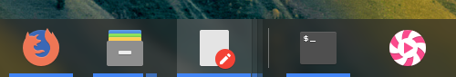
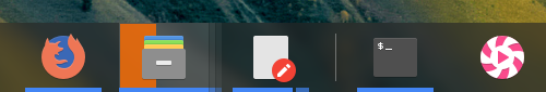
Description: Win10 style indicator for Latte, to work properly it needs Latte>=0.9.2
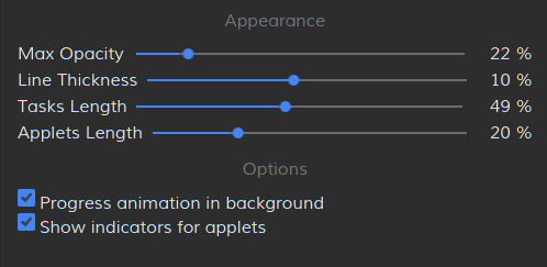
Options: -- progress animation -- properly shown grouped tasks -- option for the user to adjust applets padding -- option for the user to enable/disable progress animation
Hi, I've taken to use on https://github.com/psifidotos/latte-indicator-win10/blob/master/package/ui/BackLayer.qml#L63 the following: "color: theme.positiveTextColor". I believe it is the same used in the 'original' KDE plasma panel for representing progress, which shows as green instead under stock Breeze color scheme. Do you think it is perhaps a better fit than the current color? I believe the current neutral color is the same that is used when windows demand attention, which may be a bit confusing as it stands.
;) I will upload in the next days a fantastic video that will move between Activities and it will demonstrate Win7/10/10X layouts all running at the same time... :)
In Latte git version also now there are multiple fixes in order for Previews to like win is using them... I really like how Previews behave with click and hovering under win systems.
And also a new option in Tasks in order for Previews to work as Popups instead of as tooltips.
My friend, do you remember what I mentioned? HAHAH
This impressive looks amazing since it can emphasize the design of the proprietary system, again I mention it continues like this! You do an amazing job.
https://www.pling.com/p/1387730/


Ratings & Comments
11 Comments
Hi, I've taken to use on https://github.com/psifidotos/latte-indicator-win10/blob/master/package/ui/BackLayer.qml#L63 the following: "color: theme.positiveTextColor". I believe it is the same used in the 'original' KDE plasma panel for representing progress, which shows as green instead under stock Breeze color scheme. Do you think it is perhaps a better fit than the current color? I believe the current neutral color is the same that is used when windows demand attention, which may be a bit confusing as it stands.
feel free top open bug report/proposal at: https://github.com/psifidotos/latte-indicator-win10 and provide also screenshots
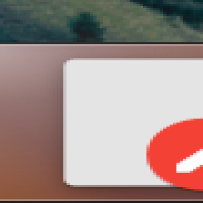
9 Is the orange background of the progress bar due to the theme in use? Or is it possible to customize the color of this element?
It is the neutral color of plasma theme in use.
https://github.com/psifidotos/latte-indicator-win10/blob/master/package/ui/BackLayer.qml#L63
10 10 the best Finally! I will be able to do an "undercover mode" for KDE !! You do an incredible job !!
;) I will upload in the next days a fantastic video that will move between Activities and it will demonstrate Win7/10/10X layouts all running at the same time... :) In Latte git version also now there are multiple fixes in order for Previews to like win is using them... I really like how Previews behave with click and hovering under win systems. And also a new option in Tasks in order for Previews to work as Popups instead of as tooltips.
My friend, do you remember what I mentioned? HAHAH This impressive looks amazing since it can emphasize the design of the proprietary system, again I mention it continues like this! You do an amazing job. https://www.pling.com/p/1387730/
10 10 the best by the way please make a macOS style :v
what do you mean for a macOs style?
i mean a dock with black or white dot indicator. default latte indicator is great, but i want it just simply black or white.