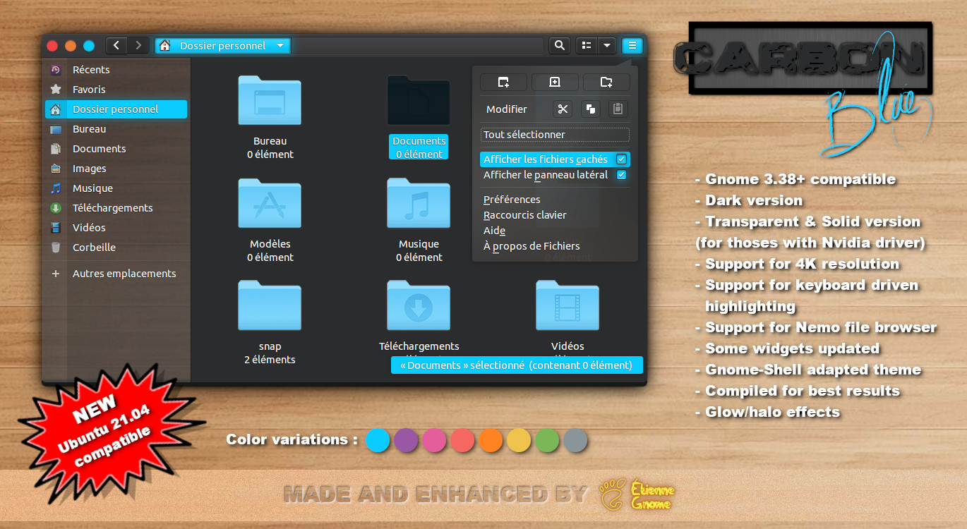
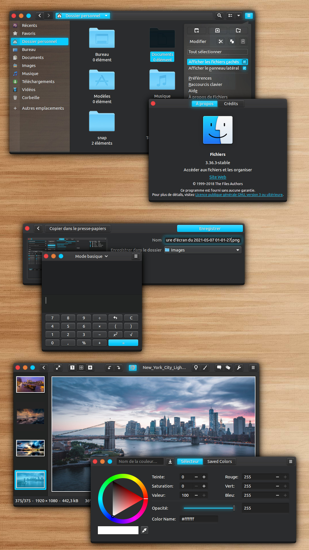
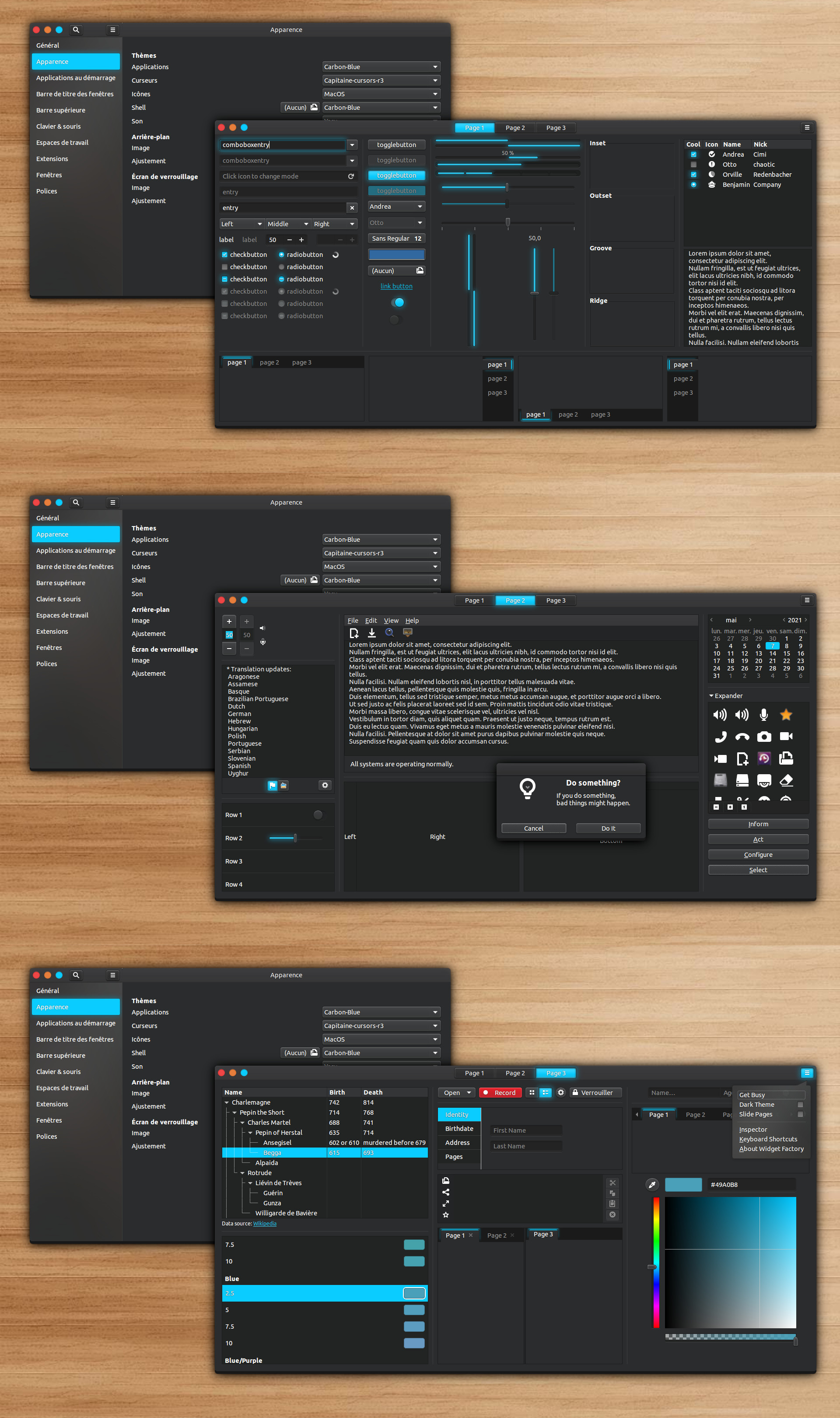
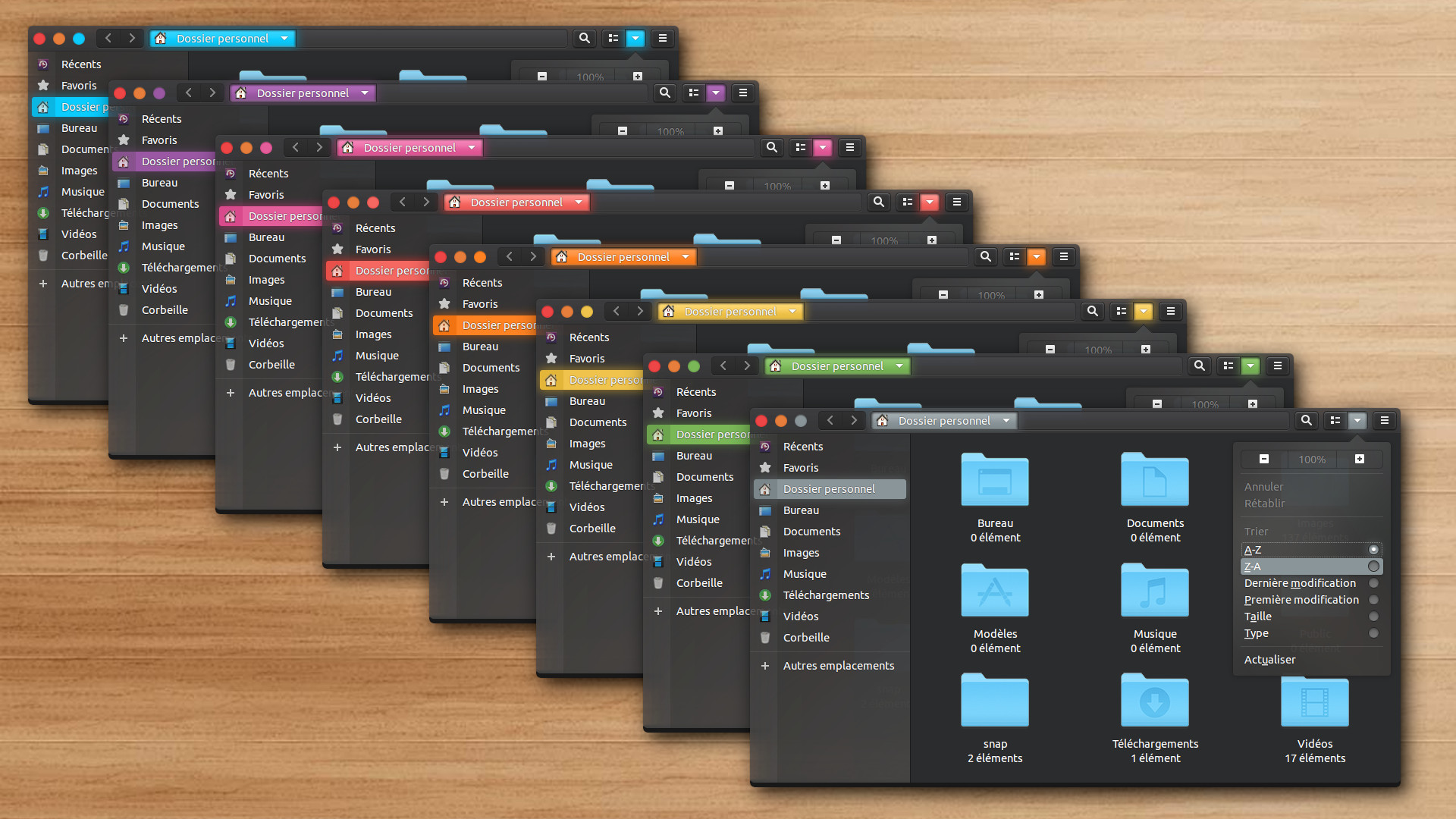
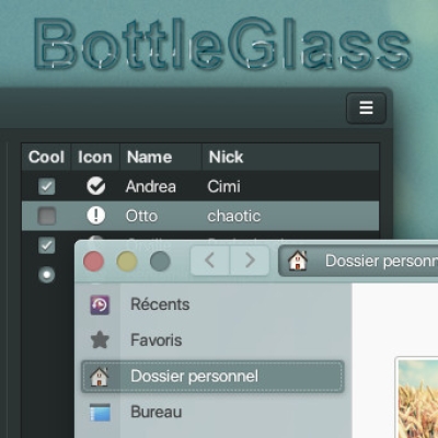
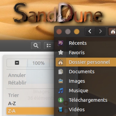
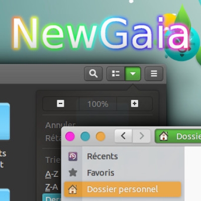
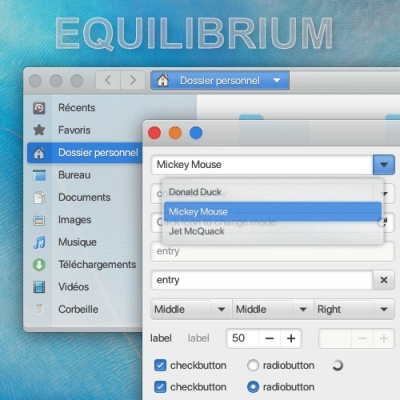
I tried some color mixes to make a new dark theme. One of my experiments is "Carbon" theme, with blue color accent in this version, and glow/halo effects on it. The widget design is based on Equilibrium, with more shadow/3D effects on buttons. It's a bit old fashoned, but I like embossed/3D UI. I hop you'll like it.
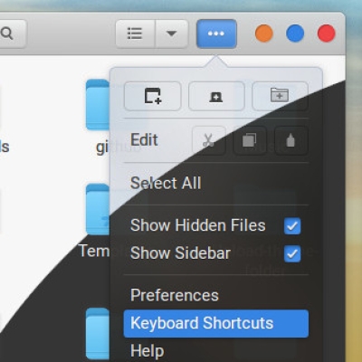
This theme supports Nemo file browser, 4K resolution, keyboard driven highlighting, and has a Gnome-Shell adapted theme. It has been compiled for the best result.
TIPS:
Users with Nvidia driver are recommended to use solid version (without transparency).
NEW:
1.0: Initial version with transparent ans solid version. 1.1: Fixed the .needs-attention class with the correct theme color, and 7 new theme colors : green, grey, orange, pink, purple, red, Yellow.
IMPORTANT:
This theme is developed for the gnome DE. It works on GTK 3.22 to GTK 3.29, and GTK 3.32/34/36/38, NOT GTK 3.30. It is also compatible with GTK 3.38+ used in Ubuntu 21.04. Warning : Not compatible with GTK 4/Gnome 40.
This version is the last one before updating to Gnome 40+ and GTK 4+
Just copy extracted file to '.themes' folder in your home directory. Then use Gnome-Tweaks tool and select the theme. For changes to take full effect, PLEASE LOG OUT AND BACK IN !Last changelog:
Version 1.1
Fixed the .needs-attention class with the correct theme color. 7 new theme colors : green, grey, orange, pink, purple, red, Yellow.
99 Excellent
IMHO the only thing to do is increase left (or right) margin for window buttons (Close-Min-Max) to make it equal to top margin. I think it would look more elegant and proportional. :)
Thank you for your rating.
I noted your remark about increasing the left or right margin for window buttons to make it equal to the top margin. However, when I measure the different margins, they have the same size.
10I love glowing themes, and skeuomorphic themes, and in this one I'd say you've beautifully joined both, so congratulations :)
I'd only point to a very minor detail, which is when a button has the .needs-attention class: the blue dot looks like standard adwaita blue, which is not visible enough (however, if it were this theme's cyan, it would perfect to me, then). Now I need to adapt my KDE Plasma to fit his GTK theme (full visual coherency is hard!)


Ratings & Comments
17 Comments
Please update this theme
10 very beautiful and elegant, thank you very much
9 9 excellent,thx ;))
Thank you for your rating.
9 9 Excellent IMHO the only thing to do is increase left (or right) margin for window buttons (Close-Min-Max) to make it equal to top margin. I think it would look more elegant and proportional. :)
And of course GNOME 40 support. Anyway it's beautiful.
Thank you for your rating. I noted your remark about increasing the left or right margin for window buttons to make it equal to the top margin. However, when I measure the different margins, they have the same size.
10 I love glowing themes, and skeuomorphic themes, and in this one I'd say you've beautifully joined both, so congratulations :) I'd only point to a very minor detail, which is when a button has the .needs-attention class: the blue dot looks like standard adwaita blue, which is not visible enough (however, if it were this theme's cyan, it would perfect to me, then). Now I need to adapt my KDE Plasma to fit his GTK theme (full visual coherency is hard!)
Thank you so much for your rating. I'll have a look at .needs-attention class for the next version.
Hey nestort, Carbon themes updated with fixed .needs-attention class. Enjoy :-)
10 It would be great if it's GNOME 40 compatible. It looks very beautiful though.
Thank you so much for your rating. I'm working on Gnome 40/GTK 4 version for my themes ;-)
Good to know! Will definitely try out when it's released. :)
9 Nice one Etienne! :)
Thank you so much for your rating.
10 Nice one, I like the glow effect!
Thank you so much for your rating.