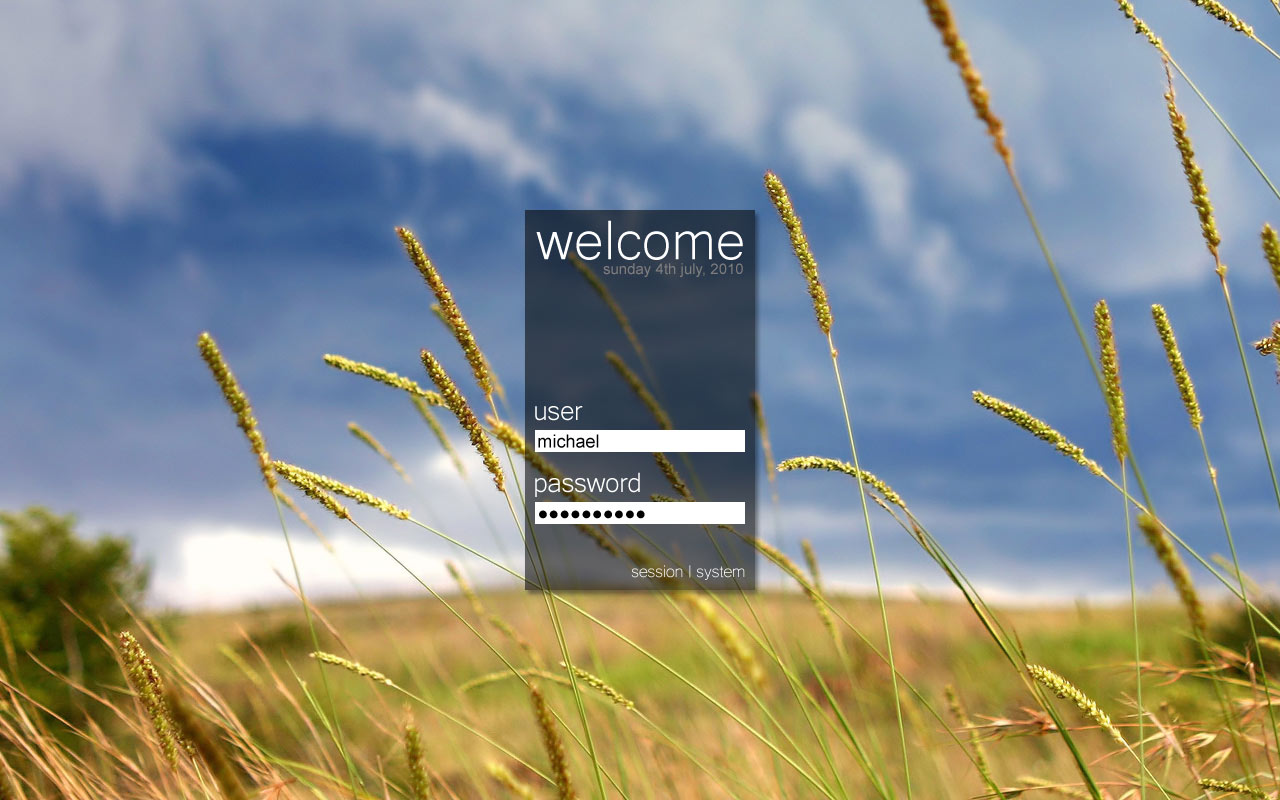
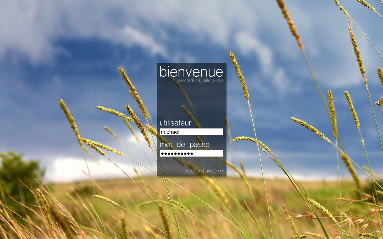
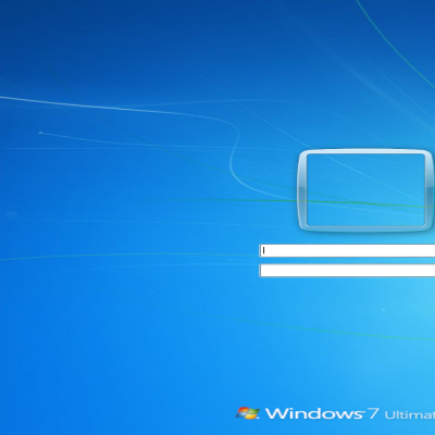
Description: A mockup for a new KDM 4 theme. My goal was simplicity and few things such as : no icons since I believe Linux is literally crippled with icons, not too much blue, I'm fed up with blue which was originally a color I used to like but kde is WAY too much blueish in every aspect and no logo, we have so many logo in here... Right now I have no idea if it's possible to design such theme. Not mentionning I haven't been able to find documentation for KDM 4 theming (KDM 3 yes, KDM 4 nothing). I'm open for help and if some courageous and talented designer wishes to make that theme alive I have the .psd files available.
just grok another kdm4 theme's source. it isnt very complex at all. the gfx (already done it seems) are most of the work... if not, a forum.kde.org post would surely help.
Thank you guys for your comment. It's nice to see people react to my modest contribution ;-) For the edges, to say the truth I'm not sure but well I may explore the blur thing.
For the 'flashy and full of effects' stuff we got around here I think we got all we need and even way more lol That mockup is kind of a reaction to that. Kde-look encourages people to be creative and it's cool. Unfortunately what I see here is most of the time the same thing with new colors, wallpaper, logo, whatever... And like I said in my previous comment, I'm totally fed up with the 'blue everywhere', 'logo everywhere' and 'icons everywhere' attitude.
Blue is a nice color (well it's a matter of taste but it's usually universally considered as a cool color). Some logos are really nice (some sucks big time however) and there are some really nice icons out there but it's not enough to put here and there some nice icons and a cool background to design something elegant, balanced and graphically coherent.
This mockup is certainly not perfect but it's an attempt to go in that direction.
I wish the kde team had that in mind when picking up the default windeco, theme/style, wallpaper, kdm theme, etc.
Default graphic choices for KDE 4 in most distros (if not 100% of them) are simply a pure disaster imho. It's not only a matter of taste. They could ask professional graphic designer if they have the slightest doubt. KDE4 is very promising and I hate to see it disfigured. It doesn't help people to see the 'inside' beauty of it.
No blur! Now it's really nice, just simple and stylish. That's what I consider elegant, unlike something flashy and full of effects like most people seem to do. E.g. Bespin. Blurring the edges would just make it kinda unprofessional and break the style.


Ratings & Comments
6 Comments
I would like your opinion please for: http://kde-look.org/content/show.php/Mockup+for+a+KDM+4+Theme?content=127744
I like your idea and I have created a theme out of it. (it's not the same, but it's good enough for me) http://kde-look.org/content/show.php?content=134806
just grok another kdm4 theme's source. it isnt very complex at all. the gfx (already done it seems) are most of the work... if not, a forum.kde.org post would surely help.
Thank you guys for your comment. It's nice to see people react to my modest contribution ;-) For the edges, to say the truth I'm not sure but well I may explore the blur thing. For the 'flashy and full of effects' stuff we got around here I think we got all we need and even way more lol That mockup is kind of a reaction to that. Kde-look encourages people to be creative and it's cool. Unfortunately what I see here is most of the time the same thing with new colors, wallpaper, logo, whatever... And like I said in my previous comment, I'm totally fed up with the 'blue everywhere', 'logo everywhere' and 'icons everywhere' attitude. Blue is a nice color (well it's a matter of taste but it's usually universally considered as a cool color). Some logos are really nice (some sucks big time however) and there are some really nice icons out there but it's not enough to put here and there some nice icons and a cool background to design something elegant, balanced and graphically coherent. This mockup is certainly not perfect but it's an attempt to go in that direction. I wish the kde team had that in mind when picking up the default windeco, theme/style, wallpaper, kdm theme, etc. Default graphic choices for KDE 4 in most distros (if not 100% of them) are simply a pure disaster imho. It's not only a matter of taste. They could ask professional graphic designer if they have the slightest doubt. KDE4 is very promising and I hate to see it disfigured. It doesn't help people to see the 'inside' beauty of it.
I looked at the mockups and I have one suggestion - If you want to create simplicity, the edges of black login box should be completely blurred :)
No blur! Now it's really nice, just simple and stylish. That's what I consider elegant, unlike something flashy and full of effects like most people seem to do. E.g. Bespin. Blurring the edges would just make it kinda unprofessional and break the style.