


Strangely, enough it fits both lighter and darker wallpapers, at least when the artwork is concerned.
In order to be usable with dark wallpapers, the colour scheme file will need to be changed (so that you can see the text in the applets
 ). The colour scheme for the darker wallpapers will be available later.
*Further development*
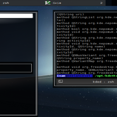
If you are interested in contributing to this theme and want to make it use all the fancy new Plasma 5 features, the sources are at git@git.kde.org:scratch/ivan/plasma-theme-spoons-dark
For more info on 'outsourcing', see http://ivan.fomentgroup.org/blog/2010/11/14/ascii-plasma-theme-and-others/


Ratings & Comments
14 Comments
10 10 the best
Very nice theme :) I love your contribution.. Lancelot and all are awesome.. This theme has few bugs with KDE 4.2 One .. It uses Oxygen plasma theme for description part ... and the text is not visible... Look at the SS : http://www.imgx.org/pfiles/16626/snapshot12.png When someone IM me . The notification show an icon to view or ignore it.. None of them work with this plasma theme :(
No doubt you are a very busy person, but this is a real nice theme and as such it deserves to have the tooltips fixed... the top of the Network Manager widget is messed up as well, and I can't seem to fix it by borrowing from a different theme... thanks,
I really like the theme, but the text color on the widgets is unreadable if it's black... Is there a way to change it? Here's a screenshot: http://omploader.org/vMWJ4bg/pm.png
Yeah, I feel this is a problem too. If you're using a black tint then black text is not a good idea. How do you change text colours in plasma widgets? /izo\
Theme like me a lot but in the calendar there are a problem with your Inkscape job, building a white-shine too fat. Thanks for theme.
I'm not sure I understand you, could you post a screenshot?
when i apply this theme i have a problem with the plasmoid tvgr...Is this your theme problem?take a look to see what i mean... http://img262.imageshack.us/my.php?image=snapshot3nn4.png
I have absolutely no idea, especially because I don't know what it should look like :)
http://img262.imageshack.us/my.php?image=snapshot3nn4.png look what is happening is the plasmoid at the left....the big one...This is happening when i apply the theme
and it should be like this(the down left plasmoid) [URL=http://img19.imageshack.us/my.php?image=snapshot4kt1.png][IMG]http://img19.imageshack.us/img19/9052/snapshot4kt1.th.png[/IMG][/URL]
I wish the theme provided a temp. gauge replacement (based on the clock) as others do... also the tooltips are not working well for me (they appear as default oxygen - perhaps that is correct though). I also wish the Task Manager active apps would display as the gray from the systray, kind of like the oxygen them does... I think that would look very slick. Just some general personal taste observations... overall, I do think it is great! Thank you.
I see that tooltips are broken... well, probably forgot to remake them after the accident with /theme customizator/ which deleted most of the files so I needed to remake them :) As for the other comment, I'm not quite following you on that one. Could you elaborate? Cheers!
The theme Plateau replaces the standard temp gauge with one that is based on the theme's clock, for the System Monitor - Temperature widget... it is very slick. I wonder every day why more themes don't do this. But like I said, very nice... I hate "complaining" about your theme in any way... the task manager comment was really just a personal taste issue. Thanks again.