
Volatile
Source (link to git-repo or to original if based on someone elses unmodified work):
Available as/for:
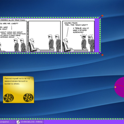
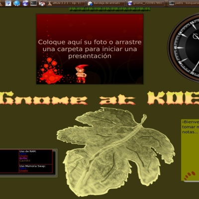
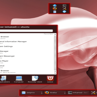
Description:Looks great on dark or colorful wallpapers, be sure to enable the blur effect if you are using compiz instead of kwin.
Credits to the authors of glassified and vistar7.
SEE ALSO: The emerald theme
http://kde-look.org/content/show.php/Volatile?content=127543
Tasks:
- Thinner and brighter borders.
- Slightly edited the transparency for brighter wallpapers.
Dialogs:
- Changed background for dialogs
Added background where it was missing.
Added systemtray icons for applications.
- Removed the old arrow style for systemtray popup. (Using systemdefault)





Ratings & Comments
9 Comments
Hello, do you have any plans to update the this gorgeous theme?
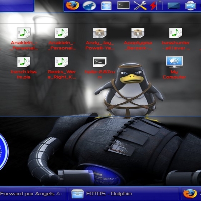
This is my favorite theme for the Plasma desktop. What is that window decoration theme shown in the third preview? It looks cool, but I can't find it anywhere.
very nice theme just one thing the pager was a bit flat i used gimp to make a new one that has a more rounded and shaded affect with highlight at the top still 5 star though really nice trancparency
Some things I've noticed this one day I used the theme: - The controlbars have black backgrounds, but that makes an to high contrasts of the icons if you have an dark wallpaper. My suggestion would be an transparent dark-grey background instead of an black one. - The menu shown when clicking on the plasma symbol is to transparent, making it hardly readable on most wallpapers, it should be an black background like the default plasmoid border. - The progressbars of KNotify have a very low contrast to the environment, an much to low - The expand icon of the Taskbar is to transparent.
Agree, yes theres alot of tweaking needed to be done. It's basicly just the taskbar and widgets/plasmoids background that has been edited so far.
Good job / Bra jobbat! ;)
When I first saw the screenshots I thought it would be to flashy to be usable. But I was wrong, It's just perfect. It totally fits into my desktop :) see http://imagebin.ca/view/OIDB19.html
Glad to hear, :) yea it fits good. I am trying not to overdo the effects but overall this theme looks better on darker backgrounds.
He pretty much summed up my thoughts on it. Freakin' gorgeous work you've done here-- I'm actually gonna be changing my QtCurve theme [from the current one which I put a lot of work into] just to match this. That's saying a lot. The *only* thing which might be improved upon is the system tray. On thin panels (~36px or less), its background covers up the border that goes along the exterior edge of the panel (e.g: http://imagebin.ca/view/RHwPFe.html). Aside from this tiny detail, perfect. Much gratitude.