


Perfection
mageden


Source (link to git-repo or to original if based on someone elses unmodified work):
0.1 initial release
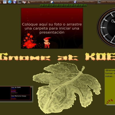
- widget background / panel
- clock
- notes color changed
0.2
- dialogs are there
- clock is updated
0.21
- repackaged for use in KHotNewStuff
0.3
- new clock
0.31
- fixes non-embedded pixmaps for backgrounds
- removed theme.desktop and added metadata.desktop
- general cleanup
0.32
- opaque dialogs
- less transparent dialogs (For the old one, just copy background.svg from the widgets folder to the dialogs folder)
0.4
- custom tasks.svg available for KDE > 4.66
0.9
optimized for use in KDE 4.1:
- new tasks.svg
- new pager.svg
- new colors file
- fixed analog clock
- fixed dialogs, tooltip and krunner
- little different notes.svg
1.0
- changed panel, tooltips
- systray changed
- copied scrollbar and tasks.svg from Silicon


More Plasma Themes from mageden:
Other Plasma Themes:

Ratings & Comments
17 Comments
I like this theme, and am sick of the blue and black themes everyone is pushing. Here we are at KDE 4.6 and this theme seems to be dead. Worse, most are re-processed and modified clones of themes I don't like. I'm tired of themes that force colors I don't want. It looks like I'll have to hack into this since it's been abandoned by it's creator.
I'm not quite sure if I have this wrong. But since the last update this theme seems to have lost much of it's charm. Those weird borders... I'm pretty sure they weren't there just before the update. Before the update it was my favorite theme. Now I have to find a new one...
Ok, seems this is a problem with KDE4.3 and that there's no corresponding update to the theme. Whatever. Was a nice theme. Would like to see something similar (not with those fancy reflections from SlimGlow)
If you could fade out the icons of minimized apps in the task manager as well it would be even better. Thanks.
Hi, for everyone who is insterested in an easy installation of this theme (and also of slim-glow, Aya, Silicon and Elegance) you can easly install it from my repository: deb http://ppa.launchpad.net/cornelius-maihoefer/ubuntu hardy main and install the plasma-themes-extra package. then just change the following file ~/.kde4/share/config/plasmarc. Replace the word "default" with the desired theme-name (Heron, in this case). Cheers.
i really like it, subtle changes, but overall it makes a noticeable improvement.
You forgot to change "slim-glow" to "heron" in the INSTALL instructions. Great theme btw :)
I think this theme is a very good candidate for the Plasma Theme Contest. See here for more details if you haven't already seen it: http://dot.kde.org/1206097090/
A couple of packaging issues (and concerning GHNS): * you're missing the metadata.desktop file (yes, I know I'm to blame for that one :) ) * the theme.desktop is not needed (again, mu fault) * you haven't embedded the pixmaps (PNGs) into SVGs so your theme doesn't work - inkscape places absolute paths as links in SVGs, so it searches for /home/magaden/Develop/Plasma/heron/topright.png and other files which don't exist on most computers :) (finally, this one was nat my fault) You have a nice tutorial for writing plasma themes at http://techbase.kde.org/index.php?title=Development/Tutorials/Plasma/Theme (includes info about embedding pixmaps) Cheers, and keep up the good work!
I hope 0.31 fixes the issues you mentioned. Thank you very much for pointing at those issues. Just tell if its still broken.
It appears to be OK now :)
hey, I just added khotnewstuff support to make all plasma themes here downloadable, but heron's tarball doesn't have a heron folder in it, but only that folder's contents. If you switch that everyone can enjoy your theme easily.
Just uploaded a new version, thank you for your advice, this is obviously my first theme and i had no idea how to pack it up.
I think clock needs a lighter frame around the darker one, like other plasmoids have. And I think you should make the preview in png format (or higher quality jpeg). I'm not sure, but I think that would result in better quality, because now it's kind of poor (and it (the current lower-quality preview) might convince people that that's how it actually looks, which would be a shame for such a nice theme). It's weird how quickly a little text becomes a lot of text.
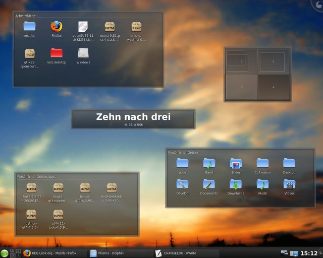
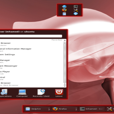
New Screenshots are up with the new heron 0.2 release. It also adds a new clock with a look similar to the other plasmoids. I think this should fix some issues. Thank you very much for your feedback.
It has a really nice soft look. Congrats!
Suggestion for clock, make those 3-6-9-12 dots about 50-100% bigger and then those dots what you now have, move them to all other hours (1,2,4,5,7,8,10,11). Or move those dots to other hours and then replace current once with solid white small line (like 2px:6px long 2:6) But i really like style.