


 )
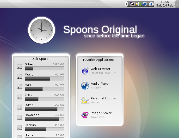
)Spoons is the first custom Plasma theme ever made. And since the old KDE's default theme (in 4.0) is no more, Spoons is in fact the oldest
The original announcement can be found here:
http://ivan.fomentgroup.org/blog/2007/09/16/new-plasma-theme-and-a-new-blog/
For a less bold version of the theme, visit: http://www.kde-look.org/content/show.php/Spoons+Lite?content=99442
*Further development*
If you are interested in contributing to this theme and want to make it use all the fancy new Plasma 5 features, the sources are at git@git.kde.org:scratch/ivan/plasma-theme-spoons-original
For more info on 'outsourcing', see http://ivan.fomentgroup.org/blog/2010/11/14/ascii-plasma-theme-and-others/


Ratings & Comments
15 Comments
Hi Ivan. I am currently playing around with themes in current Plasma 5, and think that Spoons is one of the more original themes worth to make work again. Question: do you have time to care a bit for this, or shall I take over? No idea how to do the latter here on store.kde.org, possibly will have to create a forked product entry? To unbreak the theme with current/upcoming versions of Plasma 5, at least this is needed: change in the metadata.desktop file X-KDE-PluginInfo-Name=default to X-KDE-PluginInfo-Name=spoons otherwise GHNS/KNS will install this as an overload to the default theme (currently Breeze in the folder "default", breaking Breeze (and formerly Air/Oxygen). Current released versions of Plasma blur things behind Plasma dialogs/tooltips, using the mask of the window. As workaround ons has to disable the Blur effect in the KWin windows settings. For the future (Plasma 5.16), the theme can control that blur behaviour though, but this entry in the metadesktop file: [BlurBehindEffect] enabled=false
For the record, the now uploaded version updated for Plasma 5 has the fixed X-KDE-PluginInfo-Name :)
I get the Air theme instead. /izo\
Love the theme. Only thing is that my kmenu has a nasty thick black border around it when using this theme, which makes the text of 'favorites' 'applications' and 'computer' etc undreadable, and makes the menu fatter and uglier than it should be. Anyone know how to fix this?? Its like there is a double border around the menu.
Great redo of a great theme. Possible to tell me how to remove complete transparency from Notes? I use different colors for different types of data. Tried using a different theme's Notes (via System Settings / Advanced / Desktop Theme Details), but when I apply the Customized Theme your panel gets messed up. Also, is there any way to change the background color of the inactive categories in the Kickoff Application Launcher; perhaps to a grey? At the moment, it's black text on a black background. I might use the Lancelot Plasmoid, but I can't get it to skin in anything but oxygen. Once again, SUPER STUFF!!!
Strange things :) Spoons provide no notes background at the moment, so plasma should automatically show the one from the default theme. As for kickoff background (obviously, I forgot to test is) I'm not sure whether it is possible to change only the colour of that text - I'll see what can be done. As for Lancelot, if you are using a theme that provides the needed files (default themes in KDE 4.2 do), it is just a matter (well it should be, have no idea what else could be wrong) of making sure that the new theme is saved into plasma*whatever*rc, and restarting L.
I copied the Oxygen notes.svgz into the Spoons widget directory, and all is OK. Didn't realize that Spoons doesn't have a Lancelot skin... Just assumed :( ... Though, even with themes that do have a Lancelot skin, I haven't had any success getting anything but the Oxygen skin applied. Will fool around with it when I next use a Lancelot "equipped" theme. Will wait patiently to see if you can come up with a solution to the Kickoff problem. Thanks for all of your help.
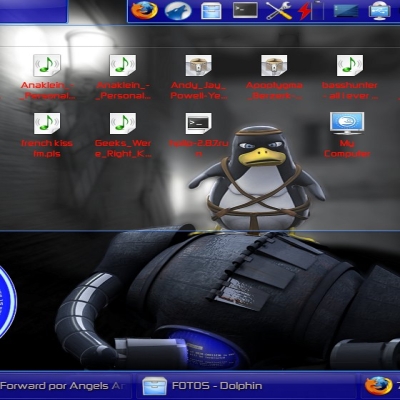
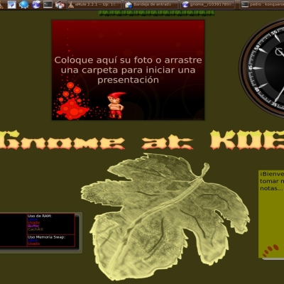
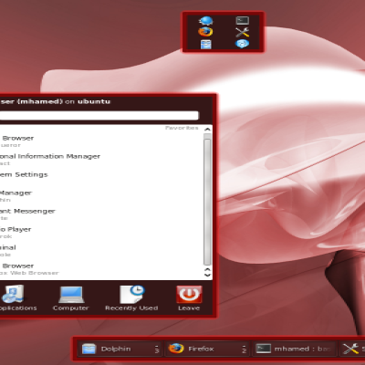
What's the wallpaper in the screenshot?
Fortunately it remained in my browsing history :) Here you go: http://sequnix.deviantart.com/art/Cloudy-111355928
Thanks
Good Job! I really love this skin! It seems so familiar to me... I love it!
I like this one. It really reminds me of the KDE3 theme Domino.
Now you have 2 themes for different occasions, one dark, sharp & flat, and the other light, curved & dull. Good to see the resurrection of this theme.
Glad to see this back!!
:) thanks