


Raphsody
ireko


Source (link to git-repo or to original if based on someone elses unmodified work):
1.8.3:
-added containment-controls.svg (see changing size of the panel)
1.8.2:
-polished notes
-now all black parts are so much more translucent
-added minimalized task in taskbar
~1.8:
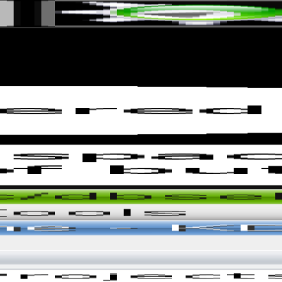
-now there is everything scalable vector graphic; it's easier to modify
-made black parts translucent
-added shadows
0.1-1.7:
-initial release, modification wasn't described


More Plasma Themes from ireko:
Other Plasma Themes:

Ratings & Comments
27 Comments
Hi, amazing theme, but look the pictures please your theme: http://imagebin.ca/view/tYAgFR4.html oxygen theme: http://imagebin.ca/view/AMXX-Z.html I hope that you fix it :) There is no way to hide the icons or make them appear Thanks
The best plasma panel theme without any doubt. It has personality, it's visually pleasent, it has borders and you can really notice at a glance which is the active window, although it's not flashy at all! Really, great great work! The only minus sides I see: - missing parts (for example the device plasmoid isn't skinned - the clock it's too glassy and it doesn't fit the theme really well.
this is an amazing theme! Please keep the transparent borders, they make the theme quite original... The only thing I dislike is the rather large border around the panel. The panel could look better anyway - it looks a bit out of place... I have no suggestions about how to fix it, but hey, you're the artist, I'm sure you can come up with something ;-)
Thank you, I have some idea how to make panel look better... (you will see changes in v2.0)
Could you, if it's not too much bother, to add changelog items when you update the theme? As you know, I am interested in Marysia, but I have no time to check it out and search for the differences every time it says /updated/ :D Cheerio!
Ok, but my english... :)
I think nobody will mind the English, thanks :) p.s. The theme looks better and better. Keep on rockin' :)
why do i have inverted corners in the bottom part of the folder view???
Thx, fixed. Does everything else is ok?
ok now it seems everything is ok. tnx!
This theme has evolved into a truly nice looking theme. I have only one recommendation: the dialog background takes up quite a bit of space. It looks great for krunner (krunner.svg) but not for the generic dialog (background.svg - used by clock calendar and device notfier). Hope this helps and thanks for the great theme.
This is one of my favorite themes. I think it's pretty much perfect except for some minor polishing. One issue I have experienced with it is that there is not logout menu that appears when I try to logout of KDE. I'm not sure if that's because of an issue with your theme or because of a packaging issue with my version of KDE.
Panel and clock are really cool. I don't like the applet bg though (too thick).
How about remove the white-transparent frame?
That could possibly solve it :)
Just a question: I can resize panel but how to put it to the centre? Can you do this with configuration dialogue or you have to manually edit plasma-appletsrc file. I know that there must be something with geometry, but I didn't succeed with this. Can you post panel configuration too?
What version of kde4 do you have?
Currently KDE 4.0.72 from Debian experimental. If I have enough time, I'll recompile (update) it from source too.
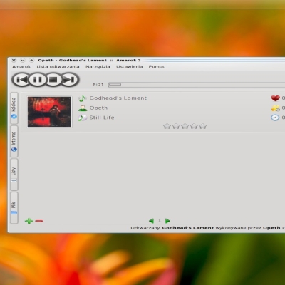
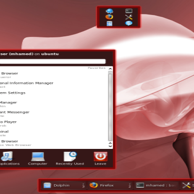
I can't post panel configuration, because haven't got kde4 installed -I didn't make this this screenshot... I'm making this theme blindly :)
Wow, then you are really good :) Or plasma rox ;D I like this theme, thanx. Greetings from Poland
nice theme, but I don't like the search dialog. But that looks like a plasma bug or lack of feature. Cause I think it was supposed to be transparent.
And it's rated 69 :D
Next bug in plasma: if there is hint-stretch-borders object in svg file, borders loses theirs transparency (you can see black pixels on the edge of panel's corner in the screenshot) but maybe I do something wrong?
...ale, przydałoby się poprawić wyświetlanie ikonek w trayu. No i czy wygląd panela umieszczonego z boku to zamierzony efekt? Zamieszczam screena: http://www.fotosik.pl/pokaz_obrazek/0791b88b358b9a6f.html
Not to forget the clock - one of the best I've seen so far.
Thank you :)