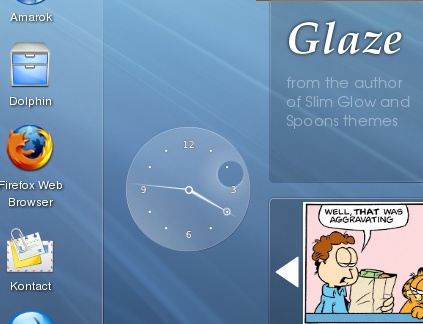
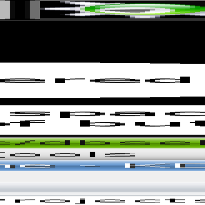
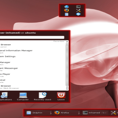
Description: Glaze is a very slim and transparent theme.
---
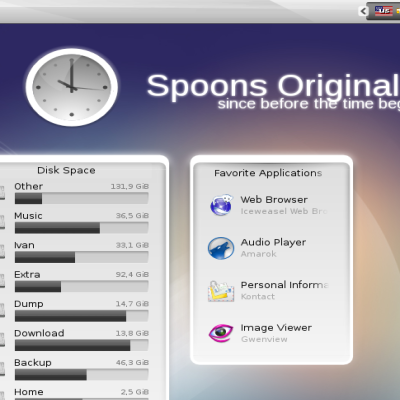
I don't like thick themes with opaque backgrounds (OK, I did make Spoons, but that was another story).
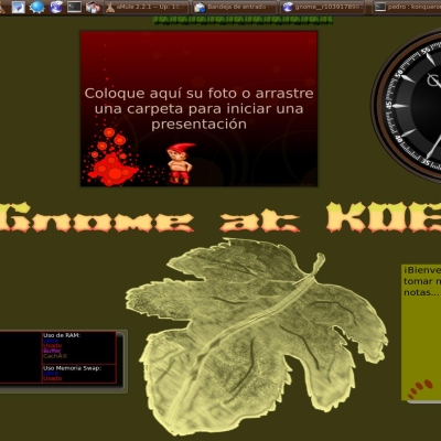
This theme is even slimmer than the Slim Glow. It looks great on simple wallpapers like the one in the screenshot.
As you can see, the clock is a bit strange - instead of the hour hand, you have a moving hole in the clock.
*Further development* If you are interested in contributing to this theme and want to make it use all the fancy new Plasma 5 features, the sources are at git@git.kde.org:scratch/ivan/plasma-theme-glaze
Love the fact that tray icons do not have a separate hole where they go in, blend in perfectly with the system tray. This might make me leave glassified.
hi
thanks for this theme. its , to me , the best, with the best clock i have ever seen :)
but can i make a request ? can you make the notes plasmoid a little transparent ? kinda like the clock , and pager , and folderview ( other plasmoids i use and would like for notes to look like )
thanks :)
Any progress on this? I love the theme as a whole, but get miffed when I forget where I put the notes plasmoid. At least giving the option for semi-transparency would make this complete. Thanks again for the good work!
Hi! I completely agree with that suggestion. In my opinion Glazed only has a drawback: the transparency of the notes. We will be grateful seeing a change on this issue :-D.
Nevertheless, the clock is simply amazing. Thank you so much for it!
It looks really great,
I do have some small things though.
The icon of main-ad.jpg in the taskbar could use some space above it, like 1 or 2 pixels. I also think the cashews of the panels could also use some space on the right.
I don't know if this are problems that are easy solvable though.
Keep up the good job!
Thank you!
Concerning the icon, there is not much that I can do without modifying the plasma's code - there are small problems with non-kde icons - in this case the icon is larger.
As for the cashews, that is the price of not wanting the panel borders to occupy much space.
I thought something like this would be the case. Nothing to do about it then, it are only minor concerns so I'll be definitely trying this theme after my exams!


Ratings & Comments
14 Comments
... the clock!!
1st time I switched from "Eleonora" to something else. Just perfect.
It's simply great! PLEASE, keep working on it!
for me one of the greatest themes, thanx for sharing
Love the fact that tray icons do not have a separate hole where they go in, blend in perfectly with the system tray. This might make me leave glassified.
hi thanks for this theme. its , to me , the best, with the best clock i have ever seen :) but can i make a request ? can you make the notes plasmoid a little transparent ? kinda like the clock , and pager , and folderview ( other plasmoids i use and would like for notes to look like ) thanks :)
No problem... as soon as I think of something, I'll do it... You will have to wait a week or so, though. Cheerio!
Any progress on this? I love the theme as a whole, but get miffed when I forget where I put the notes plasmoid. At least giving the option for semi-transparency would make this complete. Thanks again for the good work!
Hi! I completely agree with that suggestion. In my opinion Glazed only has a drawback: the transparency of the notes. We will be grateful seeing a change on this issue :-D. Nevertheless, the clock is simply amazing. Thank you so much for it!
Thanks for this one. Nice to see this.
It looks really great, I do have some small things though. The icon of main-ad.jpg in the taskbar could use some space above it, like 1 or 2 pixels. I also think the cashews of the panels could also use some space on the right. I don't know if this are problems that are easy solvable though. Keep up the good job!
Thank you! Concerning the icon, there is not much that I can do without modifying the plasma's code - there are small problems with non-kde icons - in this case the icon is larger. As for the cashews, that is the price of not wanting the panel borders to occupy much space.
I thought something like this would be the case. Nothing to do about it then, it are only minor concerns so I'll be definitely trying this theme after my exams!
Pretty like other your themes ...and interesting HourHand :)