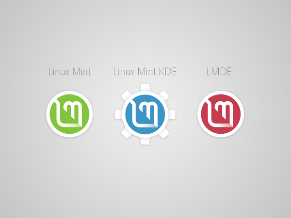
Linux Mint forum topic with other variations of this logo: http://forums.linuxmint.com/viewtopic.php?f=25&t=151363&sid=653de0c42cb6962b088f2d66424c3edc


Ratings & Comments
4 Comments
As I said about another of your submissions, very nice logo! I'm a big fan of light sans serif font types too, they are both timeless and elegant.
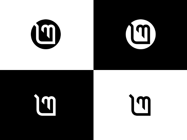
Thank you! Glad you like it! The idea was to simplify the current logo by removing the frame. Inspiration for making leaf-shaped letters came from another great concept: http://forums.linuxmint.com/viewtopic.php?f=153&t=49503
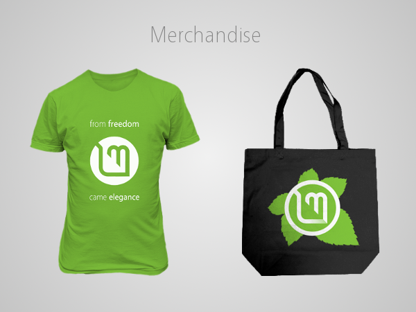
I like the handbag leaf as base for DVD disc art.
Good idea! I didn't thought of it when I was making those examples.