Description: This is not a working Theme !!! This is a modification of the first design of a flat theme that i have posted under the name of 'elmo'.
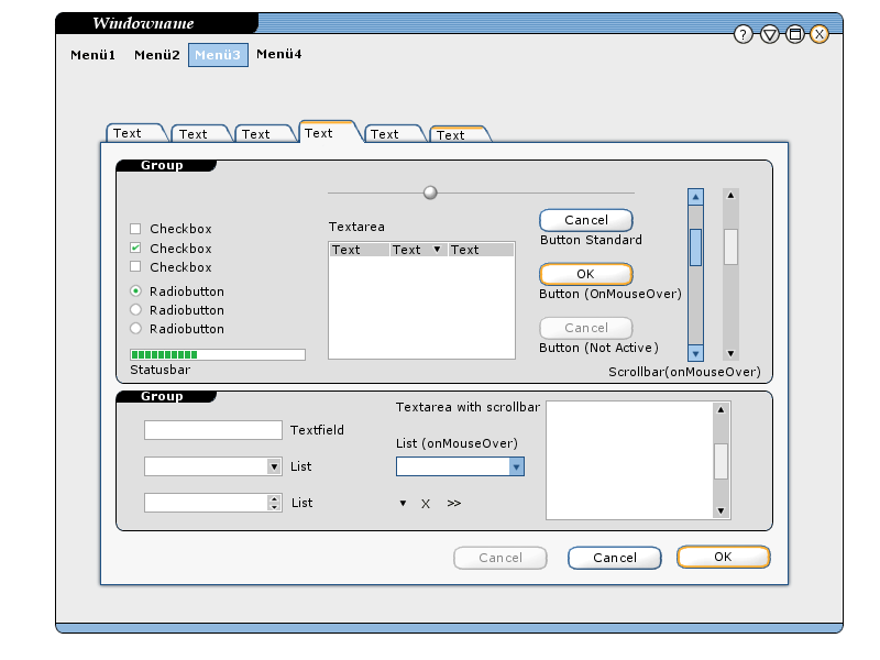
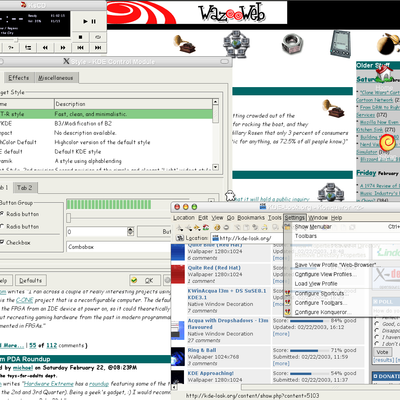
1. Screenshot ------------- the actual Theme
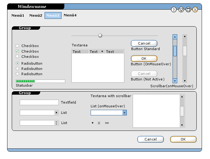
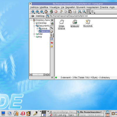
2. Screenshot ------------- The Theme with a window that doesn't have tabs
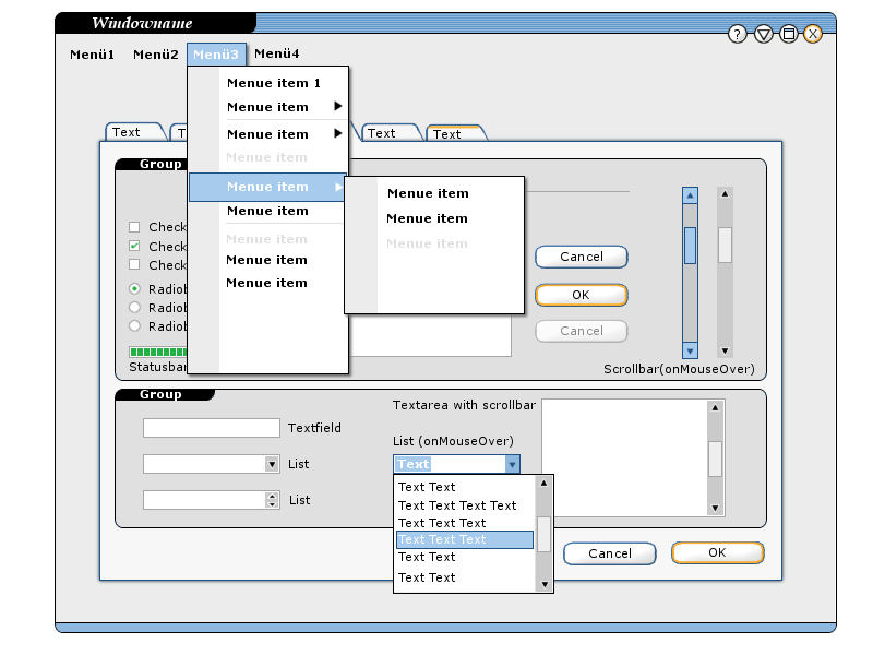
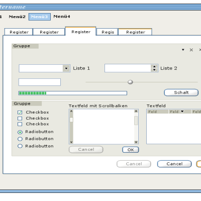
3. Screenshot ------------- the Menues of the Theme
The downloadfile is the first screenshot.
Please feel free to comment again, also comparing it to my first post 'elmo'. Again, i am not a programmer, so if anybody who likes the theme and has the skills and time to make a working theme (KDE and/or GTK+/Metacity) out of this - that would be great.
Kids, do us all a favour and read what elmo was written in the description. There is no tarball, since this is not a working theme, but only a proposal!
This theme is great ... I don't know how to make KDE themes, but i would like to learn how to make it, could someone provide me some links on how to make KDE themes ...
Instead of say "hmmmm... it's too XPish" or "It's 100% fresh & original"... I wanna make you a bit of suggestions:
* Try to make the theme in the way anyone can change the colors using the control center.
* Try to make the menues with rounded edges (such as buttons and tabs), to have a more consistency.
* Make the theme capable to show icons in buttons and menues.
* Try to add de "up" button next to the "down" button in windows scrollers, such a lot of styles... It's too confortable to scroll. (or make an option to enable/disable it)
* Publish the sources in some CVS, 'cause here there's a lot of people who can help you.
It's a promising theme, 'cause it looks really nice, and has a look of a "lightweight" theme.
Another consideration would be the Kwin style: for me, it's in the good way but, i suggest you the "transition" of color would be a bit polished, such as Quartz: It doesn't use degrades, but it's a nice looking, and try to make it capable to show icons.
Besides the suggestions... YOU'RE ON THE RIGHT WAY, IT LOOKS AS A PROMISING WIDGET STYLE...
KEEP ON WORK !!!!
Greetings from Buenos Aires, Sergio
it's nice (bith your elmo themes), but please cancel the orange(yellow) rim in tabs and the gray rim in the menus ...it reminds too much of xp :( ...but everything other is nice :)
I think an apology is in place here. As you all can read in the link above, development has started, but we never got into the alpha stage...
The main reason for this, is a timing issue -> i.e. too much work ;-)
Maybe in the future I will restart my work, but I have to admit that I like the work of Elmo a little more than what I did. We'll see what happens. Bye all!
Now I had a look at your theme and i think ist is fantastic - if you don't mind i will try and merge some of your ideas with mine - if i will have the time
ACK, I totally agree with you.
One question: shouldn't you open a discussion thread here? Only to avoid, that possible programmers don't notice your great idea... I think one should take each chance to make it known everywhere.
Regards,
GM
Well - Thanks for the encouraging responses - I really enjoyed designing this theme. Now a view words to XP or not XP. I really don't understand all the fuss - yes you are right bits of the theme were inspired (importantnote - inspired!) by the XP look - so the menues look like XP - yes i used the green and the orange for some of the elements and so on - but on the whole it doesn't look like XP because I have tranformed it, i took the things i liked (like the menues and the colours) and made something new of it . what is wwrong with that (actually the menues in office XP are very elegant - I like them) ? Without badhing or trolling anyone it certainly is more 'original' (because that seems to be the complaint) than the aqua-look, which is a straight copy of Mac OSX, funnily no one ever complains about that (as I said I am not trolling here - I think the aqua theme is great - it is just not my preference as I prefer flat themes) and even the keramik look has elements of aqua in it - which again is not wrong it is a very well designed theme someone taking ideas friom aqua and transforming them. so i guess what i am saying is - lets not get into discussions about - oh it looks too much like that or it looks too much like that, why not take elements that are designed well (or one simply likes) and use them an create something new, as i said i don't care if it is mac, windows, beos, amiga ... - at the end of the day how much variation is there really possible - you've got windows, scroll-bars, buttons etc. and most things have been done before (aqua - as in the mac osx one - problably has been the last real original theme - that's why everybody has been copying it)
So thank you very much again for your responses - very encouraging - and I hope someone will have the time and skill to make a great flat theme out of it !
As others have stated, the only really XP like elements are the buttons. That being the WindowsXP theme. The menus are OfficeXP like.
I think this look is really nice. The only complaint that I have is if you are going to go with a style, stick with that style. What I am thinking is, you started with a really flat style. Then you added the XP like buttons that are a little bit 3D-ish. I would rather you stick with the flatter style of buttons.
I really like flat styles, my current fave. is Light Style 3rd revision. I think it is extremely clean.
Keep up the great work, you have a ton of artisic talent. Thanks for sharing with us.
smeat!
be happy and see the facts this way.
somer of us saw your theme and thought "yeah! this should be standard kde look!!"
then you watch better and you see that some elements in yoyr good job make the thing "politically" impossible.
please take a step forward. you did a beautiful them. now try to think how your theme could become an "official" face to KDE, something that makes it unique.
Keep goin'
I don't know where these people saying that this "looks a lot like xp" are comming from. Haven't you even seen it??? There are no over-bubbly tri and copy mac osX look here. This is a good flat theme, where the artist has spent much time in designing it. And about the menus looking like xp, to all who say this, don't upgrade to kde 3.1, because thats EXACTLY what they look like in kde 3.1, including drop-shadows. So quit bashing this design and saying its not original. Its the most original thing i've seen on kde-look in a few weeks now. Kudo's to elmo for showing us what a good flat theme can look like, keep up the good work.
I agree
Where are the XP looks ?
The menu isn't XP at all. ( OK, maybe OfficeXP and the tabs and buttons focus) but the rest has nothing to do with XP. The guys who said XP must be thinking about WindowBlinds themes for XP I can't see any thing else...
Or is it that everything looking good must be XP ? Oh my! hahaha!
As said, I agree. I'd also say quite on the contrary, it was when I first saw XP, that I thought "Hey, micro-soft has finally woken up and now they're copying from KDE".
So, next time you start bashing kde etc. for copying m$, do your homework first. :-)
Trian


Ratings & Comments
35 Comments
I would like to know how i can download this theme. Infact, if i click over download i get a png image and not the tarball. Thanks a lot. Ripar
Kids, do us all a favour and read what elmo was written in the description. There is no tarball, since this is not a working theme, but only a proposal!
I really want to try it, but the link only brigns back an image of the interface :(
This theme is great ... I don't know how to make KDE themes, but i would like to learn how to make it, could someone provide me some links on how to make KDE themes ...
http://rikkus.info/widget_style_tutorial.html Outdated, but...
Instead of say "hmmmm... it's too XPish" or "It's 100% fresh & original"... I wanna make you a bit of suggestions: * Try to make the theme in the way anyone can change the colors using the control center. * Try to make the menues with rounded edges (such as buttons and tabs), to have a more consistency. * Make the theme capable to show icons in buttons and menues. * Try to add de "up" button next to the "down" button in windows scrollers, such a lot of styles... It's too confortable to scroll. (or make an option to enable/disable it) * Publish the sources in some CVS, 'cause here there's a lot of people who can help you. It's a promising theme, 'cause it looks really nice, and has a look of a "lightweight" theme. Another consideration would be the Kwin style: for me, it's in the good way but, i suggest you the "transition" of color would be a bit polished, such as Quartz: It doesn't use degrades, but it's a nice looking, and try to make it capable to show icons. Besides the suggestions... YOU'RE ON THE RIGHT WAY, IT LOOKS AS A PROMISING WIDGET STYLE... KEEP ON WORK !!!! Greetings from Buenos Aires, Sergio
i like it but i can't download it whats up with that? can anyone help with this?
it's nice (bith your elmo themes), but please cancel the orange(yellow) rim in tabs and the gray rim in the menus ...it reminds too much of xp :( ...but everything other is nice :)
I would use this if it existed. It is fairly reminiscent of : http://www.kde-look.org/content/show.php?content=2349
I think an apology is in place here. As you all can read in the link above, development has started, but we never got into the alpha stage... The main reason for this, is a timing issue -> i.e. too much work ;-) Maybe in the future I will restart my work, but I have to admit that I like the work of Elmo a little more than what I did. We'll see what happens. Bye all!
Now I had a look at your theme and i think ist is fantastic - if you don't mind i will try and merge some of your ideas with mine - if i will have the time
No Problem, go ahead!
ACK, I totally agree with you. One question: shouldn't you open a discussion thread here? Only to avoid, that possible programmers don't notice your great idea... I think one should take each chance to make it known everywhere. Regards, GM
Well - Thanks for the encouraging responses - I really enjoyed designing this theme. Now a view words to XP or not XP. I really don't understand all the fuss - yes you are right bits of the theme were inspired (importantnote - inspired!) by the XP look - so the menues look like XP - yes i used the green and the orange for some of the elements and so on - but on the whole it doesn't look like XP because I have tranformed it, i took the things i liked (like the menues and the colours) and made something new of it . what is wwrong with that (actually the menues in office XP are very elegant - I like them) ? Without badhing or trolling anyone it certainly is more 'original' (because that seems to be the complaint) than the aqua-look, which is a straight copy of Mac OSX, funnily no one ever complains about that (as I said I am not trolling here - I think the aqua theme is great - it is just not my preference as I prefer flat themes) and even the keramik look has elements of aqua in it - which again is not wrong it is a very well designed theme someone taking ideas friom aqua and transforming them. so i guess what i am saying is - lets not get into discussions about - oh it looks too much like that or it looks too much like that, why not take elements that are designed well (or one simply likes) and use them an create something new, as i said i don't care if it is mac, windows, beos, amiga ... - at the end of the day how much variation is there really possible - you've got windows, scroll-bars, buttons etc. and most things have been done before (aqua - as in the mac osx one - problably has been the last real original theme - that's why everybody has been copying it) So thank you very much again for your responses - very encouraging - and I hope someone will have the time and skill to make a great flat theme out of it !
As others have stated, the only really XP like elements are the buttons. That being the WindowsXP theme. The menus are OfficeXP like. I think this look is really nice. The only complaint that I have is if you are going to go with a style, stick with that style. What I am thinking is, you started with a really flat style. Then you added the XP like buttons that are a little bit 3D-ish. I would rather you stick with the flatter style of buttons. I really like flat styles, my current fave. is Light Style 3rd revision. I think it is extremely clean. Keep up the great work, you have a ton of artisic talent. Thanks for sharing with us. smeat!
Same for me It's lovely! it would be my desktop if it just hadn't those roundish XPlish buttons why not keeping them clear?
be happy and see the facts this way. somer of us saw your theme and thought "yeah! this should be standard kde look!!" then you watch better and you see that some elements in yoyr good job make the thing "politically" impossible. please take a step forward. you did a beautiful them. now try to think how your theme could become an "official" face to KDE, something that makes it unique. Keep goin'
It's a great theme,but it is the colors are too similar to XP, you could try to use a different color-scheme, but the desing is great!
But I cand download it your link is corrupted!!!!!
Dude, read the author's comments. It's only screenshots of an idea for a theme. :o)
i don't like the window border border but the rest looks beutiful!!
I don't know where these people saying that this "looks a lot like xp" are comming from. Haven't you even seen it??? There are no over-bubbly tri and copy mac osX look here. This is a good flat theme, where the artist has spent much time in designing it. And about the menus looking like xp, to all who say this, don't upgrade to kde 3.1, because thats EXACTLY what they look like in kde 3.1, including drop-shadows. So quit bashing this design and saying its not original. Its the most original thing i've seen on kde-look in a few weeks now. Kudo's to elmo for showing us what a good flat theme can look like, keep up the good work.
I agree Where are the XP looks ? The menu isn't XP at all. ( OK, maybe OfficeXP and the tabs and buttons focus) but the rest has nothing to do with XP. The guys who said XP must be thinking about WindowBlinds themes for XP I can't see any thing else... Or is it that everything looking good must be XP ? Oh my! hahaha!
As said, I agree. I'd also say quite on the contrary, it was when I first saw XP, that I thought "Hey, micro-soft has finally woken up and now they're copying from KDE". So, next time you start bashing kde etc. for copying m$, do your homework first. :-) Trian
I appreciate your work but... yugh!! XP style! Lets NOT copy the XP crap and do things better. Try something non M$ like..