


 Part of global theme.

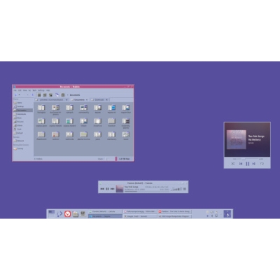
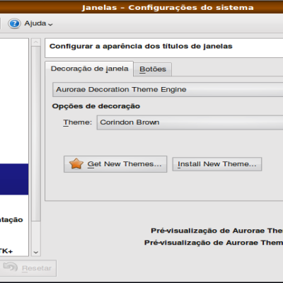
Reactionary-KDE1
phob1an


Source (link to git-repo or to original if based on someone elses unmodified work):
Part of global theme.Improve titlebar text legibility.


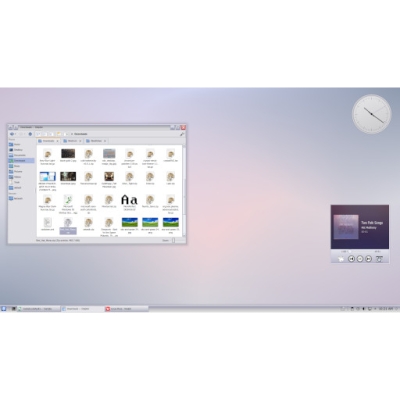
More Plasma Window Decorations from phob1an:
Other Plasma Window Decorations:


Ratings & Comments
13 Comments
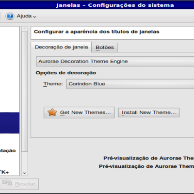
Very nice , I have one bug to report, when increasing button sizes the height of the title bar does not change and then the buttons do not fit the bar anymore, Look at the screen where I compare other themes with this one after resizing buttons. https://i.imgur.com/kbWgY19.png
In your screenshot on the left-hand theme, the titlebar matches the center graphic (normally drawn behind window contents). As you increase button size (and therefore titlebar height), the center graphic is stretched up and shown above the window contents. In most of my themes, I use differing titlebar and backgrounds. Aurorae doesn't allow me to dynamically change titlebar height depending on button size.
Just a note, looks ok for maximized window, when it get "unmaximized" then the problem occurs. But I know nothing about themeing so you are probably right/
Perhaps make the active window text black or change the active window titlebar gradient to have higher contrast? Other than that, it looks quite good!
Text contrast seems acceptable at either end of the gradient. I doubt many people would use all five left-hand buttons these days.
Mainly referring to when the window titlebar text goes over the light blue part of the gradient, should've prolly mentioned that earlier.
If it's of any help, Kontrast is a really good tool for checking contrast ratios. it does agree with you regarding the ends of the gradient, but it shows the contrast plummeting the closer the background colour is to the light blue part.
I check contrast will all my work. I don't see why there would be text over that part of the bar unless a really narrow window in which case text would already be cut off
10 10 the best
Cheers!
10 10 the best, Although I don't use it regularly, it cannot be denied that it is a great theme, very good work
Thanks. Nice to know its useful sometimes ;p